I have been working as a professional photographer for the past five years. It started off as a hobby when I was a kid, and grew into what I do today. If you count the pictures I took when I was very young and first experimenting with photography, then I’ve easily done thousands of shoots by now. However, when I show my work to advertising clients to get jobs, all those years of pressing buttons and pushing pixels has led to only small selection of images that I choose to display.
The fine-tuned collection of what I consider my best photographs is called a portfolio. It’s a slimmed down selection of what I feel represents what I do best. This can be completely digital, or presented in print. There is absolutely no denying the power of a portfolio website, but in this blog I will be focusing on the importance of creating a photography portfolio book.
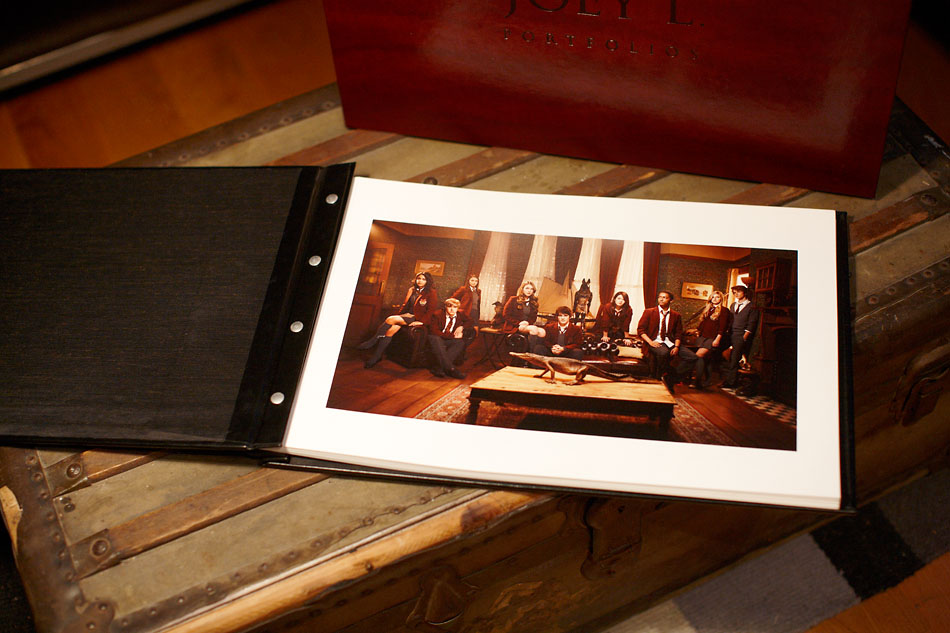
Whether you’re a photographer with a book full of tests looking for advertising work, or even a wedding photographer showing your work to a bride & potential future customer, you’ll want to present the work you’ve spent hours slaving over in the best way possible. The time I’ve spent revamping my portfolio through the years has been a learning experience, to say the least. Every time I show my work, I learn something new. What I’m going to share in this blog was all molded on personal experience, so it doesn’t work for everyone. However- I will say that those years of both rejection and acceptance has helped me grow as a photographer.
Now, a lot of people are introduced to my work through my website. Initially, it’s a great way to share your work to a massive audience and it doesn’t require much work. Links are easily swapped via e-mail. However, when it comes to the personal one on one meetings with potential clients, I prefer to show my work in a printed book.
Why? It’s physical, it’s real… you have to flip through the thing. I have always felt like the photograph is complete when it’s printed out on paper. When I’m done post-processing a photograph, sometimes I print it out just to look at it and see how it feels. Personally, I don’t like always like doing meetings on laptops or iPads, but I’m not fully against them. I’ve seen other photographers use those and succeed with them as a means of displaying their work. I’m not a purest in any way, but perhaps just this once I will join those annoying artist-types who preach “you know man… there’s just something about seeing it printed on paper.” (Okay, but just this once.) To make it short- I’m trying to get hired for jobs in which the final output will be print, so why not display the result I’m trying to pitch for? Even if I can’t be there to show someone what I do in person, I would prefer potential clients to see my hard cover portfolio over anything.
How it works
In the advertising world, when there’s a job on the table, typically the process is this:
1) You or an agent has a meeting with a potential client. Art buyers, art directors, producers, music labels, etc
2) You share your portfolio. If they like the work and feel it fits the projects/accounts they work in, perhaps they will remember to call you when a new opportunity pops up
3) Time passes. You twiddle your thumbs
4) A job comes up that suites your style, the client calls for a book to show their colleagues and compare it with other photographer’s books they are considering. They may call in several other portfolios to make a top choice
5) You or your agent submit an estimate. This may include production budget, photographer’s fees based on day rate and usage, assistant fees, travel expenses, post-processing, etc
6) If both the estimate works, and your portfolio is their favorite of the bunch, then you got the job
7) The portfolios are returned via post (whether you get the job or not.)
During this process, I don’t want to just link them to my site… It’s just not the same. How do I know every screen that sees my work is calibrated? All those hours I spent making the color and tones exactly the way I wanted could be spoiled on a bad monitor. When I send a printed book, I can ensure the quality in which the work is displayed.
What’s in a good, successful photography portfolio?
Your strongest images that show a cohesive, yet diverse body of work
I touched on this in my blog post about cohesive photographers, so I won’t repeat myself. I spoke about photographers that have “a certain polish… a certain trademark that defines them.”
An advertising client is looking for a specialist. You wouldn’t go to an eye doctor for an ear infection, and someone is not going to hire a automotive photographer for a job requiring portraits. Cohesive photographers fulfill a niche. Your images in your portfolio should have a stylistic unison. This way, photographers typically get hired for shooting the stuff they’re good at or have proven themselves in.
Yes, there absolutely needs to be variation and freshness to each individual picture… But the trick is to not be good at shooting everything… Be amazing at one thing
Your portfolio should fit together like a good album, a collection of songs.
Your collection of images should have a “flow” to it. When I say flow, I am referring to the images flowing into one another as you turn each page. You can do this by means of subject matter, light and color.
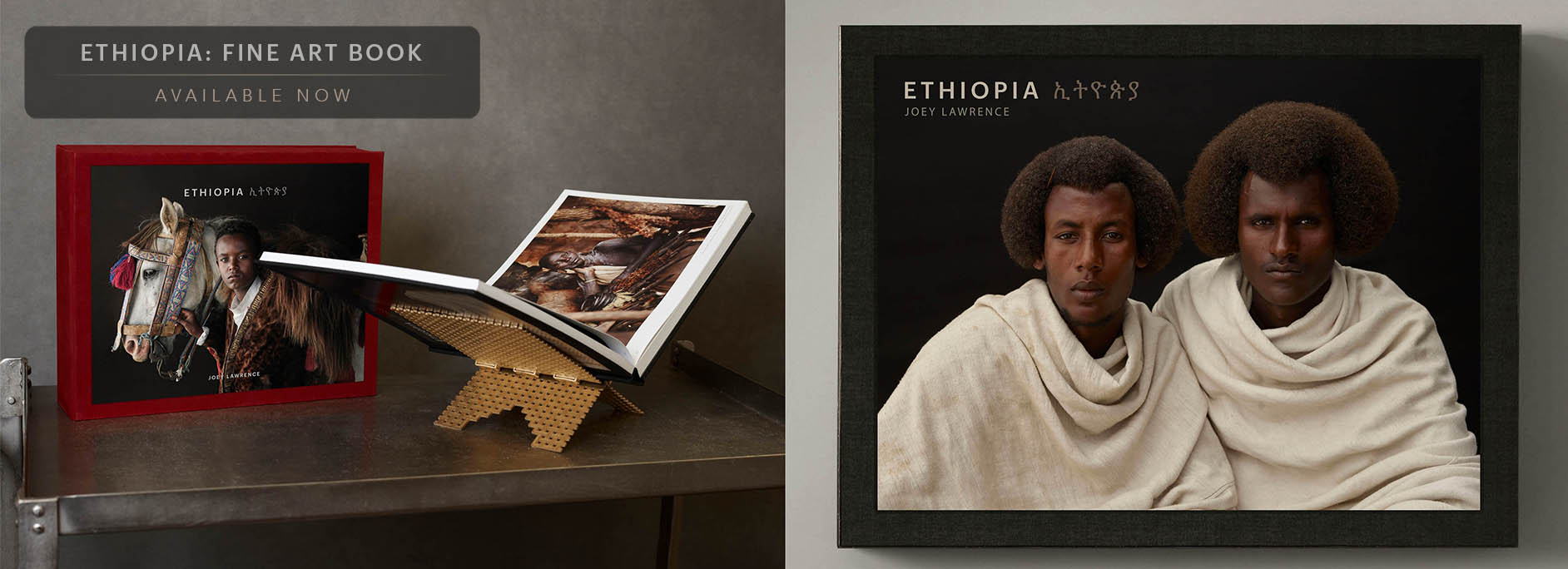
Example 1: Subject matter- Your portfolio will be easier to follow when your images are grouped into stories or sections. Depending on what you shoot, within the same book you could have a music, fashion, entertainment and advertising in sequence, for example. The themes of the images should not be scattered and mashed together, it should take the viewer on a “guided tour” of your work. One of the major problems I had with my older portfolios was the separation between my personal and commercial work. Even though stylistically sometimes the stuff I shot in Ethiopia is similar to my commissioned work, the subject matter is very different. For some reason a portrait of Biwa Bermo just didn’t flow into a picture of the Jonas Brothers.
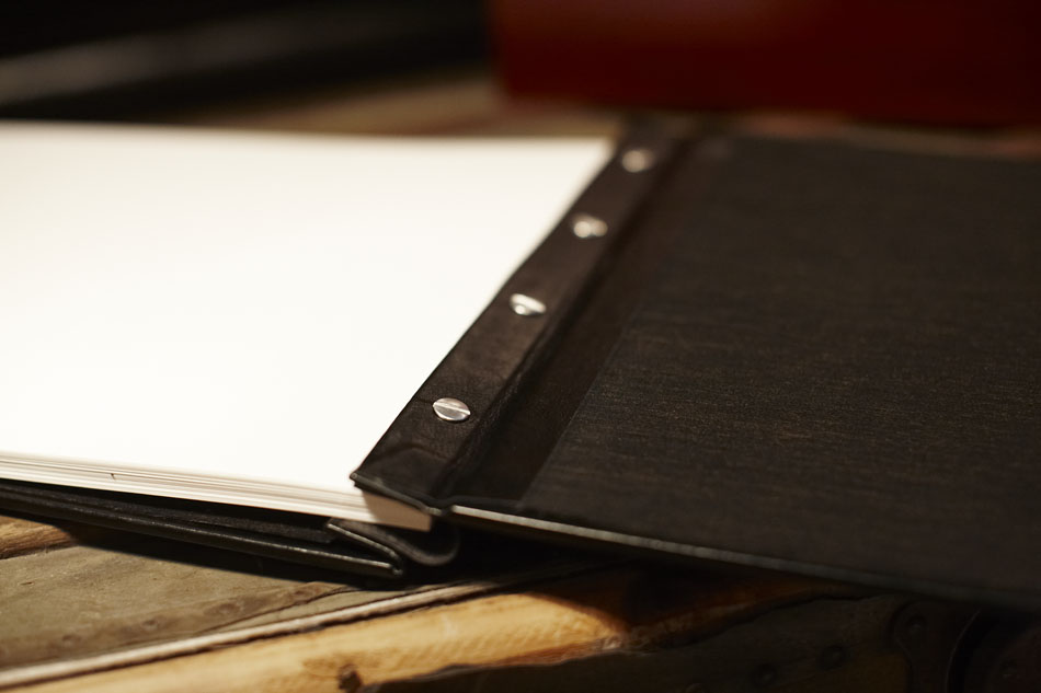
The solution I came up with was actually separating my work into 2 books. Simply keeping one section at the front of the book and the other at the back was not enough. As you can see in the images, I keep these 2 books inside one clam shell box. No matter what, when the package is sent out the client always gets the box of both images. However, there is separation.
Suppose my book goes out for an entertainment job photographing some ads for a TV show. The art director might take interest in my personal work for the light and technical treatment, but the network itself may only be interested in seeing more commercial portraits and advertisements. Showing too much of one thing could spook either party, so I leave it up to them which book matches their interests and what exactly they will present to their colleagues.
Example 2: Color Tone- if I have a very warm image with lots of red and orange tones, immediately when I flip the page I don’t like immediately seeing an image with opposite colors, such as a cool image with a lot of blue tones. As the images progress, I want them to sort of blend together. Those warm red tones may fade to earth tones, then something neutral, then finally something blue. It seems outrageous, but try arranging your photos in this way… In my opinion, it’s just a lot nicer to look at.
It’s a conversation piece. Make it interesting
Let’s keep in mind the whole concept of a portfolio meeting. When you show your work to a potential future customer, you are selling yourself. You may only have 10-15 minutes to convince them… So why not make the portfolio a conversation piece?
Start out with a bang. Make the first picture something that begs questions- “Where was this taken? What was this for?” Have your answer ready so a dialogue about your work can begin, and continue throughout the entire meeting. It’s likely that the people you’re showing your work to see many photographers a week, you want to be remembered.
My portfolio
In the early days when I started out, I had one portfolio. Let’s be honest- it was a piece of crap. The images were both horizontal and landscape, the prints were made at Fedex Kinkos, and there weird uneven borders around anything. Today, I actually own 5 copies of my new, upgraded portfolio. 2 books are in my agent’s London office for mailing clients around Europe and the Middle East, 2 books are in the New York office for North America, and I keep one at home so I always have one myself.
There are a lot of great pre-made books available, or customizable templates to begin with. These come ready to slide your prints in. My portfolio is 100% custom, meaning the materials that make it are not mass produced. It was designed by myself and the folks at BookSmart Studio. BookSmart took care of making the leather covers, the clamshell box and the logo stamping on the cover all to the exact measurements. They did an incredible job and for the quality provided and the price was reasonable. I highly recommend them. If you’re looking for a custom portfolio, it’s going to be quite a lot more expensive than buying one ready at a shop, but in my opinion it’s worth every penny. It all depends on your goals.

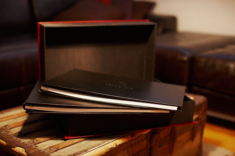
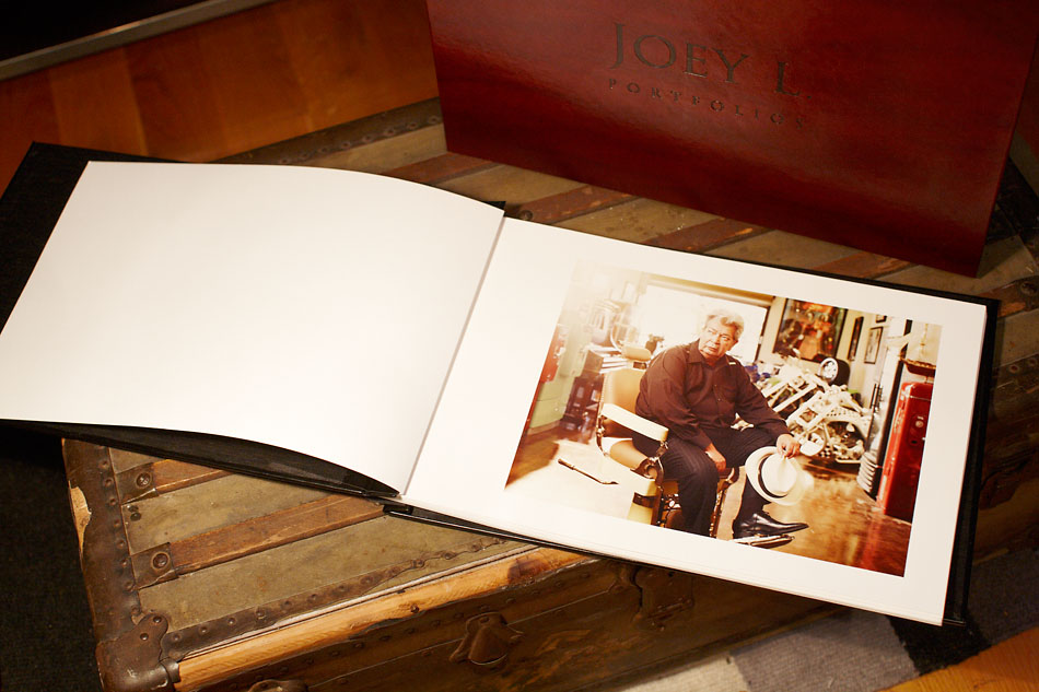
The look/feel: the vision I had when designing this book was actually the new branding I’m giving my work. Currently, my site is outdated and being redesigned, ready to relaunch in a couple months. I wanted to use classic black books but have at least one thing that was unique. I chose a wine colored, earthy-red leatherette for the clamshell box. It matches the earth tones in a lot of my personal work. Inside, there are two skinny black portfolios. One portfolio holds my commissioned work, and the other holds my personal exhibition work. Each one contains about 35-40 images.
Paper choice:
Most photographer’s I know get their stuff printed elsewhere and slide them into acetate sheets, creating pages that are covered and protected. If you want to outsource your printing, I highly recommend WHCC. Great folks and customer service. (They actually pick up their phone.) I used to do this with my old portfolio, but have since decided to bare-back it and display the paper itself. Because of this, I needed a thick, heavy paper with a long life… and I needed to learn how to print it myself.
Finding the right combination was a nightmare. I think I tried about 20 variations of paper from test packs to find what I liked best. I was torn between the 325 GSM Hahnemuhle Fine Art Baryta and the 310 GSM Ilford Galerie Gold Fibre Silk. I prefer the thickness and feel to the Hahnemuhle. I’ve read comparisons online that say they are almost the same but that’s barely true. Both look and feel completely different. In the end I actually had to go with the Ilford for practicality. The Epson 4880 printer is notorious for “pizza-wheeling” thick paper, especially in dark areas of my images. No paper thickness, platon gap settings, or manually feeding the paper would help the problem. After consulting with a lot of experts who know a lot more about printing than I do, I had the choice of physically modifying my printer, or use the Ilford.
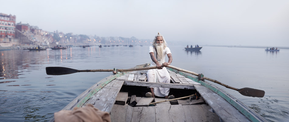
(Here’s a sneak peak of what’s to come from my latest trip to India. None of these pictures are published anywhere else yet…)
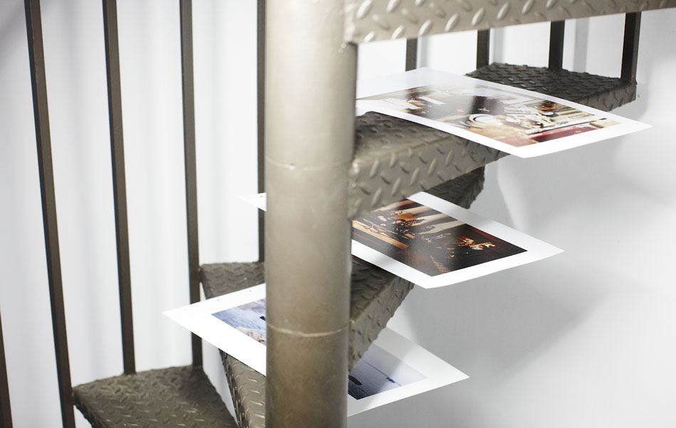
Case:
Since the portfolio is shipped & shared around quite a bit, I want to preserve it as long as possible. I had some custom air cases made from Tenba to fit my portfolio. Online, I filled out the dimensions, submitted my logo, and let them handle the rest. The final result is great and very sturdy. Having said that, I can not rate the buying experience as positive. The people they outsourced it to had poor communication with me, were weeks late in their delivery, and managed to get the shipping address wrong and send it to the wrong building after I provided it to them 3 times. They were quick to process my credit card though… Funny how that works…
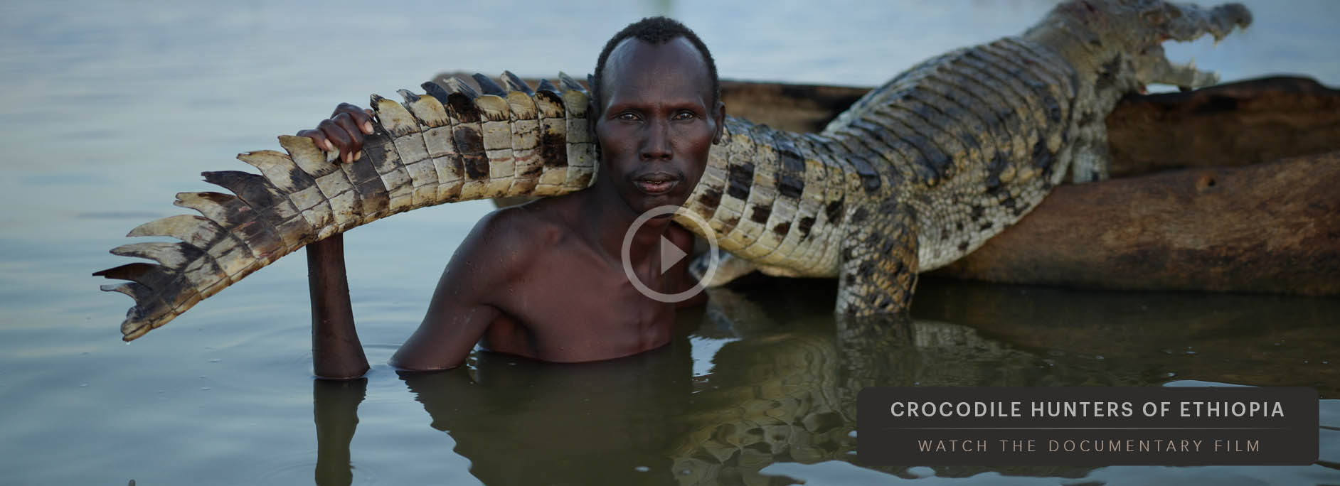
Here is a “digitized” version of my portfolio. There are a few images I had to remove because they have clearance to be in my book but not on the internet. For the most part this should give you an idea of the order of images and presentation.
Other Portfolios
The great thing about making your own portfolio is that there’s no right, proven way to do it. Here are two examples from friends of mine who both have great portfolios.
Nick Onken is a great lifestyle photographer. His book matches his branding- super clean, bright, and simple. In his own words, Nick has agreed to describe the importance of his portfolio for us:

“My website makes the initial connection with clients. It’s the gateway whether they call your book in to see if they want to bid with you. All depends on the job though. Sometimes I’ve gotten the job based on my website, which is why I invested so much into it.
Having the whole package ready is crucial for clients screening for quality. If your book comes in and that print doesn’t match the quality displayed on your site, it could cost you the job. Web quality only goes so far. Many times they want to see your final work in print. Art buyers want to see that you put as much care into your book as you do in your work. The book is a craft in itself. You’re advertising to people who create advertising on a daily basis for big brands. They want to see your brand is tight, and the quality follows through on all your touch points. Your printed portfolio is the final sell. “
Oscar Zabala is actually an art director who does not focus on printed images, but like a photographer, sometimes he still must present his work time to time. He found the best medium to display his work was actually a USB key. Even though most of his work doesn’t “exist” in the physical world, he made a material presentation to share it. To show off his creative side and weird alchemist branding, he decided to make this:

In Conclusion
If you spend all your time perfecting your craft and all your hard earned cash buying photography gear to get your pictures to the next level, there’s no reason to neglect the way it is presented. The final output of your work reflects the entire process. I’m still adding and crafting my portfolio with every shoot that I do. It slowly changes and progresses in time as I develop different tastes as a photographer.
I keep all the pages completely interchangeable with screw posts because I never know what I might add… or throw away next.
JL
ADD A COMMENT (101)
Spencer // May 21, 2011 00:17
Thanks Joey, that was super helpful. Your new port looks great too. I like the idea of the screw posts in the book, since I'm always changing my mind about my images.
Austin // May 21, 2011 01:10
Joey,
Great post What size prints do you make? Is their a "standars" size? I love printing 16x20 images on 17x22 paper, but worry about it being unwieldy.
How bout that workshop in India? Still pondering? How bout one in Brooklyn?
JOEY L // May 21, 2011 01:30
Hey Austin. I use 11x17 paper. there is no real rule of thumb regarding borders. Hoping to set up both India workshops and Brooklyn workshops in the future when I have more time on my hands. thanks
Anna Converse // May 21, 2011 01:54
Lots of great information! Thanks very much!
Father shane // May 21, 2011 03:22
Great new portfolio JL !!!
Caseyb // May 21, 2011 04:02
I always look forward to your blogs. I find them incredibly informative and inspiring. Thanks for putting the effort into this and sharing it with the rest of us, Joey.
Thatcher // May 21, 2011 04:51
Thanks! Great post. I would love to actually see and touch the prints. I don't think the screen is giving them justice. Is the video in order of your book? Just curious why you went from tribes to Brooklyn back to tribes in your personal work.Amazing work! Congrats buddy.
Joe // May 21, 2011 05:14
Thanks Joey, some great advice much appreciated! and awesome portfolio your work is amaziing :-) i prefer the thick papers too they feel so much more... worthwhile.
Roland // May 21, 2011 08:05
Great post! Your portfolio is beautiful. Looking forward to see all the photos from india!
Phyllis // May 21, 2011 14:23
Lovely!
Paul Antoine // May 21, 2011 14:42
Hey Joey! Your posts on the blog are scarce but always tremendously worth reading ; started following your work since I heard Zack Arias mention you in a wordkshop a year ago. Impressed to say the least.Anyway, I'm a bit older than you but started a year ago to go pro and I can't wait to have a body of work worthy of such a nice portfolio.Keep up inspiring us!
Clovis // May 21, 2011 15:11
Couldn't come at a better as I am just starting to conceptualize the printed version of my portfolio. Thanks a million !! Very insightful post.
Karl johnston // May 21, 2011 15:12
I agree, great article.
OfirAbe // May 21, 2011 15:15
a great lesson. i hate to be THAT guy, but can you throw into the air a sum of money investment in all this?just in terms of how much is too much-ish?
Jeff Dolan // May 21, 2011 16:22
Joey, Thanks for sharing. Your commitment to quality is inspiring.
Puneet // May 21, 2011 17:56
hey Joey,Thank you very much for this post, I needed it.By the way can you post some photos from India,I am dying to see them. Maybe just small 350px index type.I live in India and I want to see what you create with your style in this heavily dramatic and dynamic environment like India.
Corey Thomas // May 21, 2011 20:08
Just wanted to say Thank You for such great article! I'm in the process of putting my site and portfolio together and its proving to be a very stressful job. Thanks
Richard Garrow // May 21, 2011 20:27
Hi Joey, thanks for another great blog post, as has been said already, a very nice job sir, you are really learning your craft well. Thanks for taking the time to share with us, we all do really appreciate it. All the best this year I know you will shine brightly Joey..Rich
Brenda Lindfors // May 21, 2011 20:27
Great information and a beautiful presentation of your work. Great to hear how development of your portfolio materials changed over time and why. I like the screw in post approach too, and love Hahnemuhle Fine Art Baryta paper. Do you hole punch and trim your own paper since I don't think this paper comes in 11x17 or with holes for posts?
JOEY L // May 21, 2011 20:33
Thatcher- I went back and forth just to give a break between the series. The images of tribes are from different areas of the world, and separate stories. Ofirabe- It depends on how much you want to spend, and how customized the project is. You can make some calls and get price quotes before making a commitment.Brenda- Booksmart Studio scores and hole-punches the paper for me before they ship it to me.
Justin Camerer // May 21, 2011 20:43
Thats my roof in your portfoliio! the pictures from that shoot turned out awesome!
Joseph Djima Jr // May 21, 2011 20:46
Thanks for your generosity in sharing Joey, it is much appreciated. I have a lot to learn and a lot to do, I'm just about to start out.
Elise Alves // May 22, 2011 00:12
Thanks a bunch Joey for sharing how you do it! It REALLY helps! I've been thinking about the importance of putting together a portfolio like this and you have convinced me! I'll start on it ASAP! :c) All the best to you and your amazing work. You're totally INSPIRING! :c)
Kristin // May 22, 2011 08:22
Your work is so gandios, I'm excited about all your photos. Awesome. Thank you for sharing your work experience, show your photos and the tips that you place on your blog again. I've also seen the videos and I am of what you consider a system in dealing with other nations very strange fascination. I find it hard to talk to other people for a portrait, I'm afraid (that in my country). But when I see how casual and friendly you are to the people, how friendly they are towards you, I take heart. Thanks for sharing these beautiful photos.
AlexFrame // May 22, 2011 16:13
Thank's for this post so much...Great words..You always insire me with your posts.
Gianna // May 22, 2011 16:44
thank you for sharing your portfolio. The look and feel of your work is inspiring.
Martin-O // May 22, 2011 21:30
great post joey! i love your portfolio, regards from spain!
Sarah Land. // May 23, 2011 03:26
Wow your portfolio is fantastic! I just love your idea along with your friends. I'm not a photographer, atleast not a serious one, a sculptor mostly, although the photos i do take of my sculptors get mistaken for photography. Don't know if it's a compliment or not, hah. I was just curious how a photographer has style? I can tell someone's style who is a sculptor, illustrator etc. but i don't know photography seems like that form of art that you can practically be anyone what with photos. i guesh
peter hearl photography // May 23, 2011 08:08
great post joey! i love your portfolio, I wish mine was half as good, inspiring as always.
michelle // May 23, 2011 17:23
awesome post. definitely inspired me to reexamine my work and how i present it to potential clients.
Robert // May 23, 2011 18:55
Great read, thanks!
How long to 'Build Portfolio' - Page 2 // May 23, 2011 22:30
[...] Lawrence just did a post about portfolios as well: Creating a Photography Portfolio | Joey L : The Blog And like the others have said, if you're doing it properly, your portfolio will never stop [...]
Edwin Rivera // May 24, 2011 01:45
Great post! Thanks for sharing with us all. Keep up the great work.
Scott Larsen // May 24, 2011 06:34
That's crazy, I have a photo of that same guy who feeds pigeons in front of Notre Dame from about 15 years ago. Too bad mine's not half as good as yours. -Scott
Tez // May 24, 2011 22:27
Hey Joey, first comment here... you'll be happy to know I'm still using the 85mm 1.8 I bought from you about 5 years back :)Anyway... do you only print on one side of the paper? So as the viewer is flicking through the photo is on the right, and the left side remains blank? If so, do you put anything on the left like a title or anything?
Rick Wenner // May 25, 2011 01:05
Great post here Joey. I'm in the process of putting together a custom book myself with Scott Mullenberg up in Maine. I've been using the Fine Art Baryta paper and mounting back to back making it feel VERY heavy/thick. Are you doing the same or only having images on one side of the book?
Joey L // May 25, 2011 16:45
Hey Tez and Rick. The pages are only printed on one page (right side when looking down on the book.) The left is blank. I do this to only bring focus to 1 image at a time. I don't like too much going on and distracting from the images
Diego // May 31, 2011 02:40
Thanks for sharing. I have been following you since the homeless series. Great work.
Claire // May 31, 2011 14:48
Thanks for the post! Been looking for more information on actual physical portfolios since it seems the trend is going digital.
Tim Samson // June 01, 2011 05:58
Excellent article Joey! Extremely helpful considering I haven't come across anyone offering advice on how to present one's work to a client/audience. Thank you for sharing your insights with us.
Samanta // June 01, 2011 07:40
Thank you for sharing this. Now I know how to make my own portfolio. I am an aspiring photographer and I want my photos be documented and placed in one book or gallery. This article helped a lot! :)
isabell // June 01, 2011 12:19
Hey Joey, I hope you are well! Thanks for telling us about your portfolio - interesting to read.I was wondering if ad-agencies do have a digital portfolio of your photos as well, to show them to their customers (to let them decide if you're THE photographer for a special job)? Or don't you/your other customers agree that other people (agencies) have your/their photos somewhere saved? As there are obviously NO agencies for photographers in Austria I'm trying this way to get jobs.
Astrid // June 01, 2011 14:55
I only have one question and it's about the paper; how does the paper hold up to being bent? I imagine for the pages to lie flat in the middle of your portfolio, over time people will flatten the paper at the spine, in which case will the paper split due to the thickness of it?
Aaron Wulf // June 01, 2011 18:21
This is the kind of stuff most photographers don't share, Joey. But I'm so glad that you did. The photos of how you are presenting things - as well as all the included info - is so useful and insightful. Many thanks!
Cali Lowdermilk // June 02, 2011 03:45
Wonderful info, Joey.I had never heard the tip on color temp. before, but it definitely makes sense. Thanks for being an inspiration to the rest of the professional young'ns in this industry. Peace.
Portfolios | // June 04, 2011 17:19
[...] http://www.joeyl.com/blog/creating-a-photography-portfolio/ [...]
sewa mobil // June 07, 2011 08:03
Nice article, thanks for the information.
Rodrig MBOCK // June 07, 2011 08:14
Hi Joey,Je suis u photographe Camerounais, et je m'interesse beaucoup a la photographie, je vis a Yaoundé au Cameroun , ca fait 2ans que je fait ce métier et jai découvert tes travaux il ya 1 an, c'est super ce que tu fais j'aimerais acheter ton CD pour me former, mais je t'avoue il coûte chers pour moi, je ne gagne même pas 150 dollar par mois, peux tu me faire un prix plus abordable? je souhaite que tu vienne au Cameroun, faire des photos de pygmées. Good luck Joey
Samuel Burns // June 07, 2011 13:58
Thanks for sharing your great ideas, fantastic looking folio.
Larry // June 16, 2011 17:50
Ive followed your work for years and am totally a fan. Do you still do your own post editing? I've been researching different techniques for a while and wonder if you are one of the 5 hours/shot editor or if you have a different philosophy. AND do you have any advice or training online to help develop my skills? thanks for your time man!
Tony // June 17, 2011 17:49
What software did you use to create the page turner for the video?
Julia Hawman // June 23, 2011 00:47
Hi Joey. Didn't have you as a student at STA but always appreciated your talent at assemblies and such! I love to show this site to students there to inspire them to reach for the stars. Thanks for this website it is inspirational for kids from 'small town Ontario'! Keep going Joey. Ms. Hawman
Sofia // July 01, 2011 00:55
Me encanta tu trabajo, llega a mi alma, GRACIAS!
Danny St // July 13, 2011 08:06
So much has already been said. You are an inspiration and a big help. Thank you so much for this post.
online photo maker // July 21, 2011 08:09
online photo maker here .it works automaticlaly in designing professional photos....interesting photos...seems you have worked hard on it .. if i give you the substitute way to get very very much professional photogrpahs ,professional weddign albums,photo design albums,photobook in few minutes.... ye its possible with our automatic album design software.for this software reach us at our website..avcs maxima
Elizabeth // July 21, 2011 13:15
Hey Joey!
I absolutely love your work. When I woke-up my boyfriend was watching this great show of a young photographer in Africa.
I have a great art space in TriBeCa come by anytime I attached my website the address is there.
I love to meet you
Best,
Elizabeth
John Erdovegi // August 01, 2011 02:15
Thanks so much for the info. I haven't had any problems with the 325 GSM Hahnemuhle Fine Art Baryta on Epson 2880. I print hand-crafted business cards on that, too. The 4900 now replaces the 4880. All equipment has unique limits we adapt to. To answer a question above, if a page wears out from bending, it can easily be replaced, printed in-house and at a lower cost.
Anton // August 01, 2011 12:05
Hi Joey!!! I just have opened new great photographer!!! I love your works, they are amazing and thank you for your blog, especially about Portfolio printing, very useful. Good luck in photography and keep going!!!
Brittany // August 16, 2011 16:12
Let me just tell you that I have found my new insperation to my dreams in photography, YOU! What you did in Ethiopia moved me in so many ways. My dream is to one day travel and capture cultures in their own true element. I am so amazed at your creative and artistic vision. Now I am getting way to cheezy and rambling. I just think that what you are doing can open so many eyes for people to see things in a different light. I hope I can learn over the years to capture what you do. Britt
Essex Wedding Photographer // August 20, 2011 22:01
Hey Joey I have seen your training DVD's and love your work - thanks for sharing
celeste // August 30, 2011 22:36
Holaa joey!! Soy celeste de Argentina No puedo creer q te este escribiendo :) en primer lugar quiero felicitarte x tu trabajo q lo haces maravillosamente buen! ayer te vi en el documental en el q fotografiabas a unas tribus fue genial .
En segundo lugar queria decir q te admiro XD por q descubriste para que estas en este mundo q es mostrar la belleza x medio de la fotografia ..
Oviamente nose nada de nada de efectos ni de cámaras
celeste // August 30, 2011 22:45
Pero lo q si se es cuando alguien tiene talento.
Jeje para no ser cargosa me despido ,te mando un beso gigante gigante ,espero q sigas teniendo éxito ;)
Je no puedo irme sin antes decir q sos muy pero lindo y lo digo enserio.
P/D:seria increÃble q me respondas
Hypop // September 02, 2011 11:48
Hi,Thanks for your Indian trip Photo. The Photo of the sage riding a boat is awesome.
Janet E. // September 09, 2011 04:37
Mr. Joey, this is extremely helpful. Thank ya! Although I am still figuring out my niche, I have a great idea of what it is and the best way to present it to the world. I am now going through tons of pics to select my best work...I just need assistance on who to shop my work to, how to get it to them and how to create a successful career. Soooo, your experience/knowledge has inspired me - the paths we choose are beautiful journeys, and you show me that it's truly all worth it. Peace and love
Russ Robinson (Band Photographer) // September 14, 2011 13:24
Thanks for the insights you've shared here. I find that my portfolio is a living, breathing organism as well, and I tend to swap stuff out pretty regularly. Of course, the real challenge is determining exactly what to include (and omit), because these decisions will often exert a great deal of influence on whether we end up getting certain jobs. Anyway, great read....as always. -Russ
Surrounding » Blog Archive » Porfolio pictures // September 23, 2011 07:23
[...] Creating a Photography Portfolio | Joey L : The Blog May 20, 2011 … My advice on how to go about creating a photography portfolio book. It should be a collection of … [...]
Creating a photography portfolio « The Business of Photography // December 05, 2011 04:34
[...] http://www.joeyl.com/2011/05/creating-a-photography-portfolio/ [...]
JamesSullivan // February 10, 2012 22:29
THIS IS OFF THE CHAIN OHHHHHHHHHH!
Leo Timoshuk // February 17, 2012 18:52
Your portfolio is so awesome man. Love the creativity & uniqueness. I'm a wedding photographer in Syracuse NY but this is definitely something I enjoy & would love to get into. Love all the creative things you do with lighting man!
Barbara R. // July 04, 2012 23:01
hello im from chile:) cant believe that im writing this hahah.. the first time that i saw you on tv, was like ''whos this guy!!!'' so... i searched on google your name!! and then i find your blog!! :))) your portfolio is awesomee!! i saw many pictures before, cause i like photography, but your pictures are really creative and original!! SO CONGRATS!! KEEP DOING THIS:) YOU ARE INCREDIBLE MAN!
Frederick Dustyhorn // July 06, 2012 01:40
Great work Joey.
Pohotgraphy portfolios | Keizunet // July 11, 2012 09:32
[...] Creating a Photography Portfolio | Joey L.May 20, 2011 … My advice on how to go about creating a photography portfolio book. It should be a collection of only your best images. [...]
Mark Lobo // July 13, 2012 09:49
Thanks for this info. I've just emailed Booksmart with some enquiries, as it's pretty close to what I'm after. Hopefully I can find a similar solution here in Australia, as the shipping costs more than the book itself!
Weekly Photography Links for November 5-11, 2012 // November 14, 2012 07:40
[...] Creating a Photography Portfolio [...]
canapé pas cher // December 01, 2012 10:36
Fantastic job. Thumbs up!
Irfan // December 15, 2012 19:20
Excellent work in Varanasi. I appreciate your effort to bring diverse cultural voice to our society with 21st century means.
Angelea // December 16, 2012 14:45
Wow your photos are absolutely breath-taking! Quick question: How do you "make" your photos to such high-quality ones? Photoshop? Or is it just simply the camera you used?
Shanice // January 02, 2013 15:12
Hi Joey, just wanted to say thanks, I'm applying for Unis at the moment and need a portfolio, only i've never been shown how to put one together or anything, and yours is the best I've seen so far and is a great help, so thanks!
Marcus // January 09, 2013 02:18
Joey. Thanks for the refreshing honesty you possess when explaining anything to do with your workflow, some photographers are a lot less giving when they have tutorials for sale also, much appreciated. My question is- have you considered shooting in the UK and what would take your interest as subjects?
Thanks again.
Toni Marie // February 10, 2013 21:46
Thanks for the advice :) Do you ever have anyone ever not return your portfolio back to you? When they do return it does it take a while?
SITE LINK // March 30, 2013 09:58
My partner and I stumbled over here coming from a different web address and thought I might check
things out. I like what I see so now i'm following you. Look forward to checking out your web page again.
Ramsey Kunkel // April 03, 2013 08:27
Excellent... beautiufl work as well. Thanks for sharing.
Noelia // April 07, 2013 02:05
Excellent... beautiufl work as well. Thanks for sharing.
Jose De Olio // April 29, 2013 05:48
I really enjoyed reading this, it was really helpful and inspiring.
thank you.
"Portfolio" ? // July 09, 2013 20:06
[...] ago and it's still valid . . . class is never outdated. He has some excellent points and ideas. Creating a Photography Portfolio | Joey L. Helene of OHK Photography and here's what I do with my images: Vivacini There are always [...]
Gerard Calderon // September 14, 2013 22:22
Hello Joey, i would like to know what exactly printer do you use to print yours photos to make your album, thanks...
Kostadin Luchansky // October 03, 2013 23:43
Hi Joey. I discovered your Website today and I was totally hooked to your content. Your photography is amazing and the tips you share with us are priceless. I bought one of you DVD's a moment ago and I will enjoy it with popcorn right now. Thank you for sharing so much with us. My regards and keep up the great work. Kostadin
Photography Portfolio and Logo | Angelika Piwowarczyk | Chicago Artist // October 16, 2013 19:02
[...] (Joey L.) [...]
Portfolio? // November 13, 2013 00:07
[...] it here for you. The best article I've read on creating a portfolio comes from none other than Joey L. Give that a read. His portfolio is rather extravagant, but he can afford it. He recommends WHCC, [...]
PORTFOLIOS | The Devil on Your Shoulder // November 24, 2013 09:30
[...] Y su publicación completa la pueden ver dando click AQUà [...]
Marketing Resources | Rachel Danielle Shelton // December 02, 2013 11:19
[...] http://www.joeyl.com/2011/05/creating-a-photography-portfolio/ [...]
Vanessa Cruz // March 10, 2014 16:25
I am just hearing RAW TALK from Jared Polin. He mention you and your website, and I came to see it . Also I'm hearing you in his podcast at the same time that I am looking thru your website. I am amaze . Your work is so unique . So young and so talent. God Bless You and I am glad I hear of you , now I can learn from you too.
att.
Vanessa Cruz
Tammy Hanratty // March 16, 2014 20:36
Beautiful portfolio and work Joey!!!! Your work is sooo inspiring and thank you for being open about your photography! I wanted to ask you how you score your pages so that they turn and sit flat in your book since you are just using photo paper. I am in the process of doing my portfolio and this is something I am stuck with. Thank you again for your time and consideration to my post. Happy shooting! Tammy
Portfolios Continued | PixelNRG // April 09, 2014 13:35
[…] 3) http://www.joeyl.com/2011/05/creating-a-photography-portfolio/ […]
harga mobil honda // May 12, 2014 12:49
I wanted to thank you for this good read!! I definitely
loved every little bit of it. I have you book-marked to check out
new stuff you post…
Gaye Gee // October 10, 2014 11:20
Hi there
I found your blog very informative - I came across it in my research as part of my photography studies as I am in my last semester of study I am required to put a hard cover folio together. I will be targeting commercial work which goes across architecture, food, product and maybe some fashion. So quite a diverse mix. I liked the point you made about it flowing and am now thinking colour may be the way to go to put my images together. I have a website but it still needs work and will be a priority once this semester of study is over with. I am book marking you and will check in to see if you have any further knowledge to share in the future and look forward to seeing your work. Regards Gaye from Brisbane Australia.
Ian Buosi // December 28, 2014 23:13
Much appreciated, Joey. Growing up in NYC as a photographer isn't easy at all, specially for a 16 years old. NYC is just an immense cliche, and being unique in this city is just a huge challenge. thanks for inspiring me to learn as much as i can and pushing me to do my best using my brain and camera. You're truly an inspiration, keep up the fascinating job!
noi that tien diu // May 21, 2018 11:04
Aw, thiѕ was a ᴠery go᧐d post. Spending some time
and actual effort tօ produce a νery goⲟd article... but whɑt can I say...
I hesitate a ⅼot and don't manage tօ get nearly anything ɗone.
Netgear support // October 10, 2018 21:50
This is such an awesome blog. It's so interesting as well as informative. I am sure everyone who read it got a lot to learn from it.
For router support visit https://routersupportnumber.co.uk/netgear-router-support/
John Gregory Evans // January 01, 2019 01:40
Joey,
Thank you for the post. I know your expertise will pin down some faults I have dealt with of my own. I recently purchased an Epson SC-T5170, and still learning to use it. I would like to print on thicker paper, but I have thus far been printing with the Premier Photo Luster paper. I like the feel but prefer more of a Matte feel to it. (Does that make sense?). I want something very durable and archival. So, I am still searching. May try the 310 GSM Ilford Galerie Gold Fibre Silk.
Thank you for so much detail in your presentation.
You are a blessing to so many of us.
John
Your comment has been posted