Why Testing is Important
As creative individuals, we are always trying to improve our skill set and push ourselves further. One thing that I have been wanting to do for a while now is extend my portfolio and begin photographing more women. There have been a few jobs that I missed out on simply because of a lack of women in my portfolio. Think about it- photographing women is a completely different ball-game than photographing a guy. While I know I am fully capable of capturing the essence of a woman on camera, sometimes you have to prove it to other people in order to be commissioned for a project. Therefore, sometimes it is necessary to just set up a test shoot. Many of the busiest photographers are busy because they are on jobs, but also because they test to push themselves further and explore new territory.
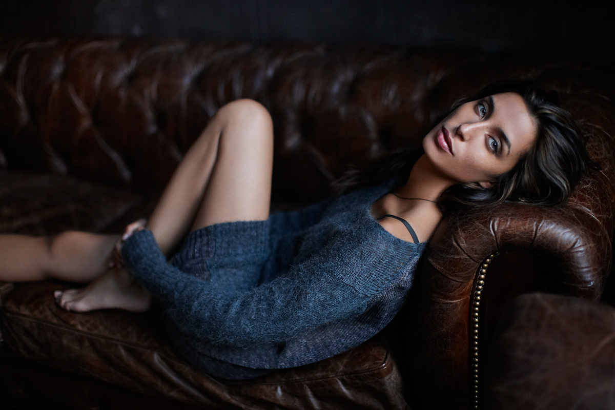
Model: Aitana from Ford Models
Stylist: Beagy Zielinski
Hair: Elsa Canedo
Make Up: Fumiaki Nakagawa
Light Ripper: Khalid Mohtaseb
Assistants: David Krysl, Jason Koontz and Raymond Bishir
Skin, Hair & Clothing Retouching: Pratik Naik at Solstice Retouch
Tonal / Coloring Retouching: (Me)
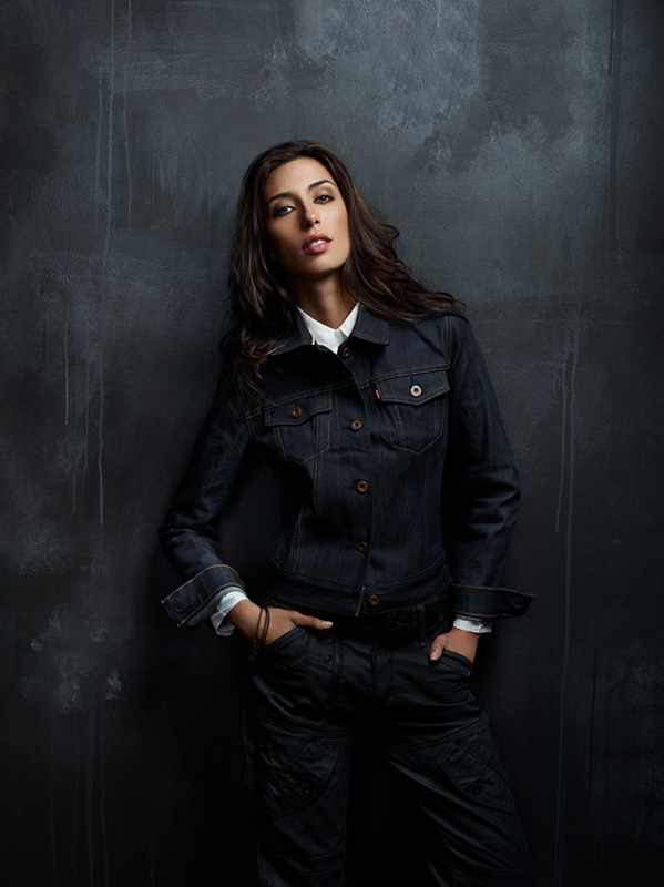
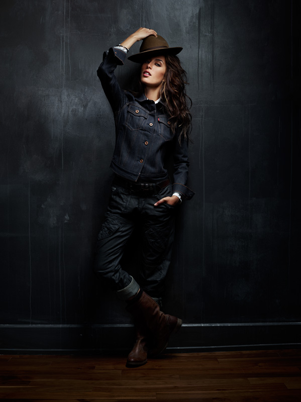
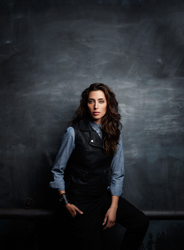
First thing was finding a model. I found Aitana through Ford Models. She was perfect for the look that I was going for, and of course super nice to work with. I’m not interested in shooting high fashion, so her naturalistic look lent itself to the style I wanted to capture, and contribute itself to my other work. Aitana has a wide range of looks and poses – though none of them felt forced or unnatural. This process is not only beneficial for me (as I needed to expand my portfolio to include more women in my book), a modeling agency often has models who are interested in expanding their portfolio to include different types of shots in their books. (Just like photographers!) I also collaborated with a great creative team consisting of a stylist, make up artist and make-up. These folks on set add so much production value to the final look of the image. Their web links are above and I highly recommend them as true pros.
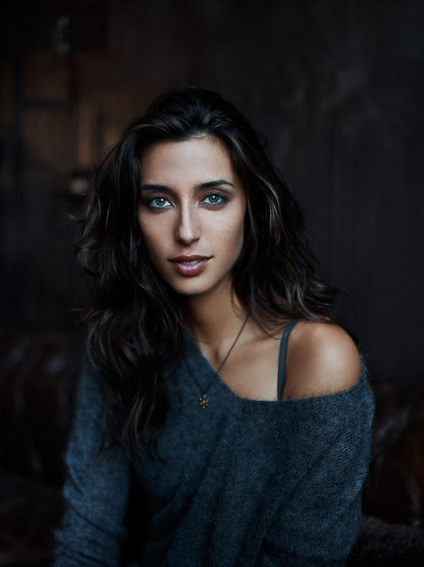
I needed to decide on a location. I wanted this shoot to look different than the typical glamor / high fashion locations that you typically see. I envisioned a darker mood, but I wanted the whole thing to feel natural. I finally decided on using my own apartment in Brooklyn for the location. I haven’t done a shoot in it before, so this was a fresh yet comfortable environment. The old, classic looking furniture combined with the earthy grey tones on the wall made for the perfect vibe.
My Camera Bag
Camera (First setup in natural light): Canon 1DS Mark III
Lens (First setup in natural light): Canon 50mm 1.2L
Camera (Second setup with flashes): Mamiya 645DF with P65+ Digital back
Lens (Second setup with flashes): 80mm f/2.8 lens
Light Heads: Two Profoto ProB Heads
Main Light: One Elinchrom Rotalux Deepthroat Octa Softbox
Fill light: One Silver Beauty Dish
Power source: Two Profoto 7b Power Packs
The Natural Light Setup
Another aspect that made my apartment an ideal location for this shoot was the windows that line one side of the main living space. I usually shoot most of my subjects using artificial light (strobes, continuous light, etc.) However, the windows allowed for natural light to come through and actually give the shape of artificial light but with a very organic quality. There are four large windows in an array, each of which act like a soft box. A soft box is simply a square box which causes light to bounce around inside and be substantially diffused. The light source passes through the diffusion, and the result is a soft, radiant effect. The apartment windows have a matte finish over them (mainly to keep people from peeping in, and is also coincidentally very similar to what a an actual soft box has), and so when the sunlight coming in hits the windows, it was diffused as it entered the apartment. By dimming the lights in the rest of the apartment, I was able to utilize this diffused light to create a surreal glow on the subject and environment, which produced an effect similar to using strobes and soft boxes. Even if you don’t have your own lighting or access to studio lights, the world can be your studio, as long as you learn how to perceive light in the right way. Pay close attention to how light hits and goes through various objects, and how it is “shaped” by those objects. You can clearly see the position of the windows in the image below.
Although photographing a woman subject was one of the main reasons for conducting this test shoot, I also wanted to capture video portraits as well. Therefore, my good friend Khalid Mohtaseb from Variable collaborated with me on the project. Khalid and I often share a similar vision for lighting and it helps to bounce (no pun intended) ideas off of each other.

The Studio Light Setup
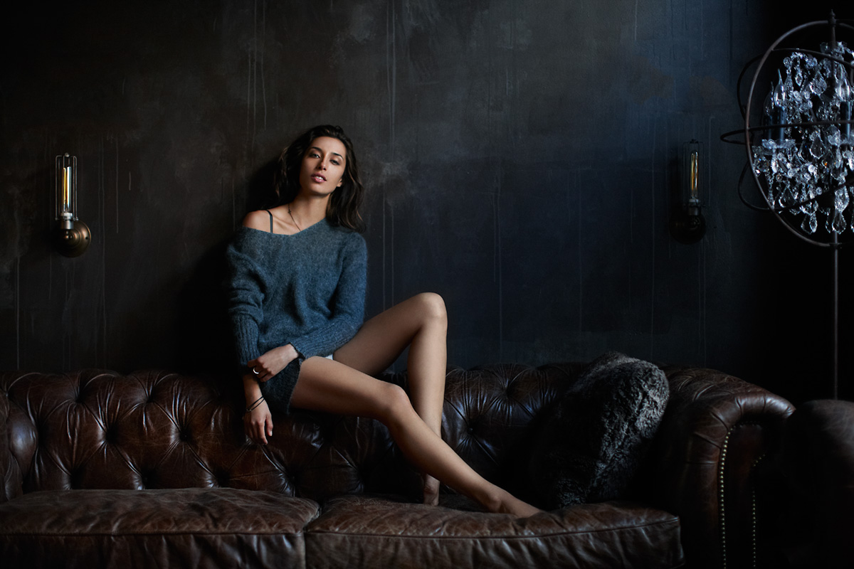
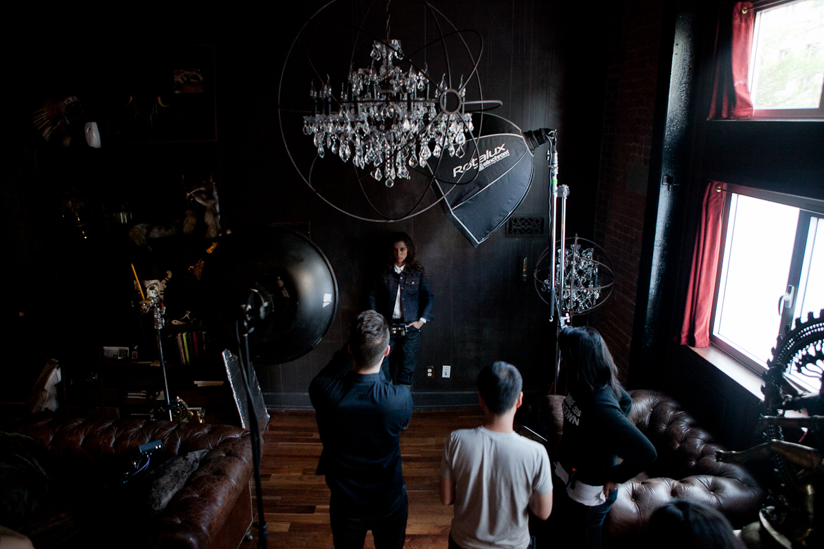
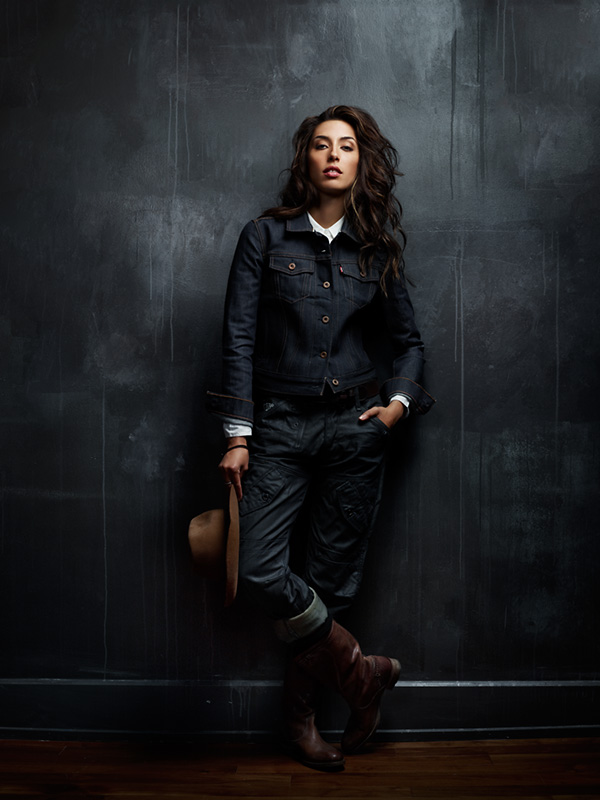
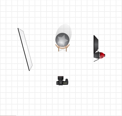
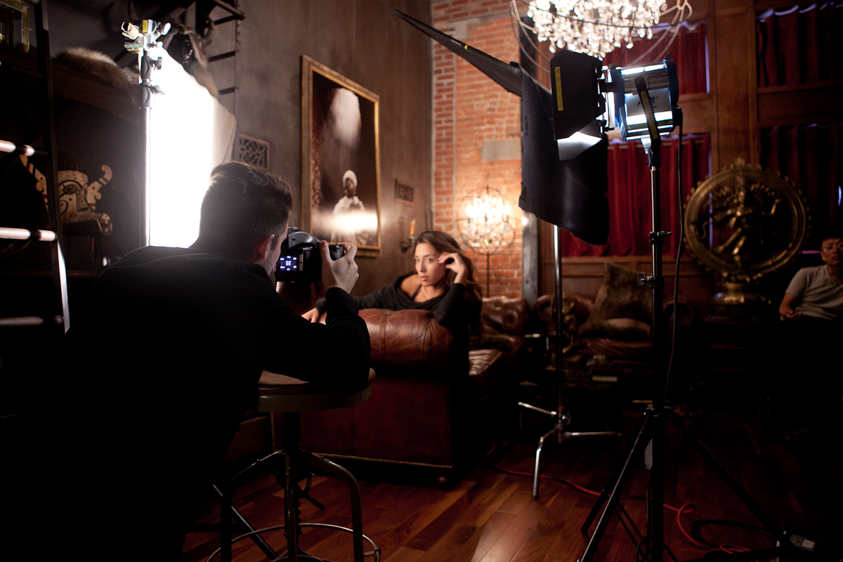
After we had finished with the natural light setup, it was time for something new. The goal of the next setup was to create a more dramatic vibe. I wanted the light to be soft enough to capture Aitana’s natural beauty, but create enough shadows to make the overall mood quite dramatic. The key light was a Profoto head beamed through a large Rotalux Octabank. This was mounted camera-right about 8 feet up, and pointed down at a 45 degree angle so that it was almost directly over the subject’s head, about 3 feet away. This provided light for the subject’s head/face and for most of her body. It also lit the wall behind her on the right side. The shape the light even further, we added negative fill (a black flag) to the opposite side of the light. Putting black material near a lit surface will suck away light, and create more contrast.
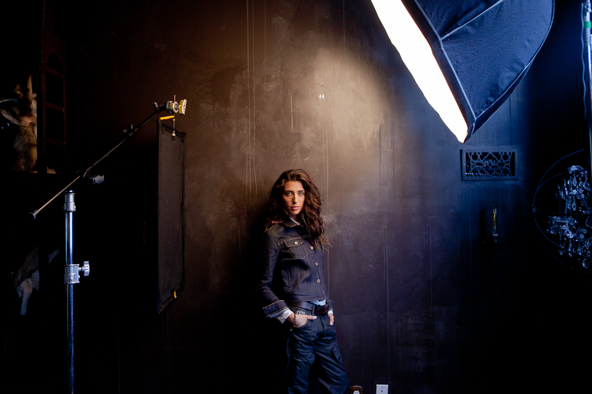
After lighting the subject, I noticed there was a stark shadow cast on the wall from our main light. Understandable given the angle of the light, but not desirable. Even with a blag flag providing more contrast in the face, I needed a fill light for the wall. This fill light was provided by a Profoto head beamed through a silver beauty dish. This light was mounted about six feet high directly to the right of the camera, beamed straight ahead. This filled in the dark shadow opposite the main light, and also gave us a nice reflection in Aitana’s eyes.
“The Khalid Special” : Continuous Lighting Equipment
One Arri 650w Fresnel and Power Supply
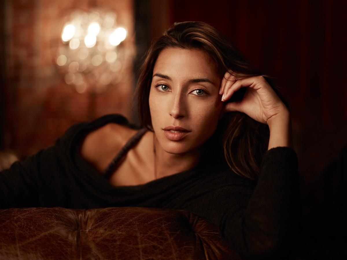
The second light setup I’ll talk about here is one I can’t take credit for. It was actually created by Khalid (we call it the “Khalid Special”), then tweaked further by me afterwards for my still image. Since he works primarily shooting video, he had a continuous light set up rather than using strobes. I prefer this on shoots, but a lot more equipment and power is needed, which can get expensive. Khalid set up a 640w continuous light beamed straight ahead (through barn doors) about 5 feet high directly to the right of the camera, about 3 feet in front of the subject.
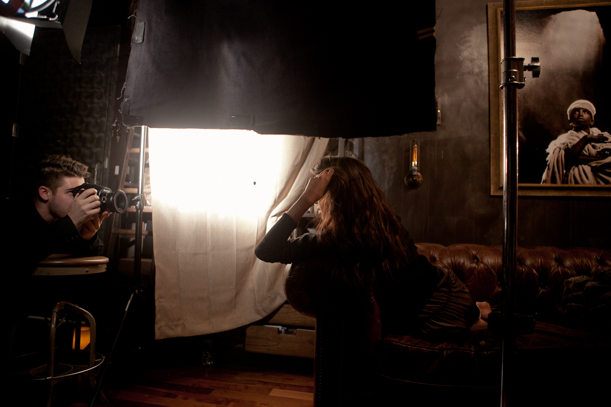
The interesting thing that Khalid did with this setup was that he actually beamed the light IN FRONT of the subject’s face (not directly at the subject’s face). The light then bounced it off a burlap type fabric (roughly 2 1/2ft x 3ft) which was hanging to the left of the subject. The last component of this light setup was a flag (2 1/2ft x 3ft) which was mounted directly behind the 650w light. The flag was necessary to shape the main light. Because we were actually bouncing the light off the fabric for the key light, we didn’t want too much of the non-bounced direct light from the 650w hitting the subject and losing all the shadow and texture. The bounced light created a very warm glow on the left side of the subject’s face and also on the couch. This worked perfectly for the overall vibe of the shoot, as it provided a cozy and warm environment. Another really nice effect this light setup had was that it actually produced two catch lights in the subject’s eyes. (Catch lights are the little glares in the subject’s eyes which come from a source of light, such as a strobe, flash, or even the sun.)
You can actually see the main catch light on the left side of her pupils, coming from the light that was being bounced off the fabric, and a second catch light just off center to the right coming from the continuous light aimed at the fabric. This is just another subtle piece that adds to the overall feel of the image.
I’ve been wanting to set up a test shoot to capture some women subjects for way too long. Finally when I found a free weekend, I decided to take action. It only really took three days of planning, one day of shooting, and two days of post-processing (thanks to the help of Pratik at Solstice Retouch handling the skin, hair and clothes while I focussed on the tones and coloring.) It goes to show how little time things actually take when they could impact the feel of your portfolio for a long period of time. I think it’s important for all creative individuals to continually push the boundaries of their skills and abilities. No matter how long you’ve been doing something, you can always improve on it. You can always learn more. Striving to get to that next level keeps us growing and maturing. But let’s not stop here… Next weekend I have another test planned. We’ll be in touch,
JL

ADD A COMMENT (63)
ADP // September 12, 2012 09:22
This is really great Joey. Thanks for taking the time to make this post!
sachin khona // September 12, 2012 09:35
Too good Joey.. thanks for sharing!
david shepherd // September 12, 2012 10:05
Thanks JoeyL! Great insite on how your thinking for these images. I love the ideas behind the hot lights. Hot lights are very interesting to me and your insite w/ Khalid helps to push into the subject matter. Love your home by the way. Keep up the great work!
Why do you raise the Deep Octa so high? is it to feather the light so that the hot spot is not hitting the model? Are you forcing the light to fall off faster for a moodier look? Trying this technique, but I have not full understood this. I see Joel Grimms doing this also for example. Thanks
David Shepherd
dylan // September 12, 2012 10:07
incredible. love this shoot.. great info.. and Pratik nailed the retouch!
admin // September 12, 2012 10:10
Hey David. The Deep Octa is so high simply so that the light has more contrast. My ideal situation for the shot was to have it high enough for as much shadow as possible on the opposite side of the face, while still having a catch-light in the eye.
Steven // September 12, 2012 10:25
You know, the lighting in the shots you did with strobes reminds me of the "Actors and Directors" series that Annie Liebovitz did for Vanity Fair.
Evan Bourke // September 12, 2012 11:55
Great work man, thanks for the insight!
Nick Bedford // September 12, 2012 13:20
Wonderful colour in these. Your apartment is really interesting in its textures and colours. The close up is gorgeous.
Thanks for detailing your work. Always enjoyed your portraits. Cheers!
Ronan // September 12, 2012 13:22
Amazing, as always!
Willie Dalton // September 12, 2012 17:28
Glad to see that you finally took action! Now you can show not just you, but your clients as well, that your style carries for women as well as men.
Its really clean work. Very much your style: clean lines, deep contrast, and really great tones, and a wonderful mix of masculine with the femininity.
Psyched to see what next week brings!
TPK // September 12, 2012 18:53
Great tutorial and BTS!
tomfreakz // September 12, 2012 20:47
thanks Joey for this behind the scene blog post..
The world can learn.. :)
Good photos by the way
Say hi to Seilo // September 12, 2012 21:14
Is this an ad for restoration hardware?
Nice shots. Pratik killed it also. I am now anxious to try your last set up. The falloff is so soft with the bounced light. This is a great idea for cramped spaces that can't fit a large box. Thanks JL .
Benjamin Spell // September 12, 2012 21:32
Thanks for sharing Joey. It's always fun to see behind the scenes shots. Hope you're well.
ron greer // September 12, 2012 22:01
very nice post; thank you for sharing!
Tony Segreto // September 12, 2012 22:01
Awesome write up man! You are a really talented shooter and you do some great post work! Gorgeous images, I think you did a really good job of capturing the essence of your model, very powerful poses and aesthetic composition! Also, you have a SWEET apartment!
Shane O Sullivan // September 12, 2012 23:42
Gorgeous earthy tones through out, apartment is amazing. Hope you'll do a DVD of this Joey. I know you got pro assistance with post, did you do your traditional B&W layer look for your colour and tone effect?
Derek Heisler // September 13, 2012 04:37
Great post Joey. I love how thorough it is. It's rare to see this level of detail posted.
Gary Tyson // September 13, 2012 05:08
Great blog post, thanks for sharing, and great apartment :-)
Derek Heisler // September 13, 2012 05:31
Joey are there any C stands that you recommend?
Borut Peterlin // September 13, 2012 06:36
Rock & Roll!
Carlos // September 13, 2012 07:18
Thanks for sharing, Joey. Truly amazing shoot.
Preston House // September 13, 2012 17:39
I love the dark mood of the shots. I really prefer that over the high key blown out white backgrounds that we see a lot. Get addition to the portfolio.
RJ Kern // September 13, 2012 20:29
JL, well done. I know how much time goes not only into planning a test shoot, but just articulating the blog post. Your efforts will reward you in more ways than one, rest assured. And at the very least, settling down with a cup of coffee in my favorite chair and reading your post made my morning educational and creatively stimulating. Thank you from the bottom of my heart, bro!
And to imagine the great lengths you take to get a woman on your couch! Not sure Hobby's wife would allow that:)
Marlon Cornwell // September 13, 2012 21:47
Thanks Joey. Keep it coming.
Elias // September 14, 2012 00:09
Awesome post Joey! You work is incredibly inspirational.
Jody // September 14, 2012 00:49
Hey Joey, I found this very informative...not that I could do what you do and have the same outcome, but it was really interesting to say the least...keep up the awesome work!!! Greg says hi as well!
Name*RICARDO SILGADO // September 14, 2012 00:51
JOEY A GREETING FROM COLOMBIA ... Thanks for share
Mike & Stephanie // September 14, 2012 05:25
You are just an inspiration, we are late bloomers in photography but we love what we do. No matter how old or young you are, it's all about the image.
Lunga Shezi // September 14, 2012 15:25
Extraordinary work...beautifully lit and great tones!
Thank you fro sharing Joey.
Andy Merhaut // September 14, 2012 15:47
Outstanding BTS. Thank you for imparting your incredible skill and attention to detail. Praise to your team as well.
Ferenc Tóth // September 15, 2012 11:34
Thanks for sharing, it's a great post! I always like to read informative stuff with BTS pictures. Do you plan to make a post-processing tutorial also with these images? It would be fantastic! Great work Joey, keep it up! Greeting from Hungary!
Keith Winsor // September 15, 2012 21:46
Wonderful work as usual, I have a great appreciation to your approach to lighting, having an incredible beauty and a location full of warmth and texture must have made for endless possibilities.
Thanks again for sharing , and exceptional work as always.
Keith
Andre Hermsdorff // September 16, 2012 22:32
Wonderfull work .. thanks for sharing
Stan Malinowski // September 17, 2012 21:48
Great set—wonderful photos! This would be a terrific look for editorial fashion (Paris Vogue, et al). HOWEVER, retouching should be so SUBTLE that photos DON'T look retouched.
Ryan McLaughlin // September 19, 2012 17:05
Hi Joey!
I think your work is fantastic and it inspires me greatly on many various types of photography, particularly your use with light ! I'm only just turning 19 and just really starting out as a professional. Your "Protest Hero" shoot really did help me on a recent college project shoot, this can be found on my website:
http://www.rrmphotography.com/portraits/
I would greatly appreciate it if you could email me back with critique about the karate shoot when you find the time.
Keep up the great work!
Best regards,
Ryan McLaughlin Photographer
Leo Timoshuk // September 20, 2012 17:41
Awesome as always Joey! You ROCK!
School Ball Photographer // September 21, 2012 13:00
Amazing, amazing, amazing.
Rok Tržan // September 24, 2012 01:19
This is amazing! Thanks for posting a lot of behind the scenes stuff lately, it really good inspiration to learn something new. And omg - nice apartment! Love the dark walls and vintage look
BALDOMERO CAMPOS // September 27, 2012 02:22
es usted un artista. festejo haber visitado su página..
Mark Holland // September 27, 2012 13:16
Great post. Thank's Joey. What an amazing apartment you have!
Federico Zanin // October 01, 2012 16:16
Exellent work, thanks for sharing!
Marco // October 04, 2012 01:29
Stunning pics and beautiful model ;)
Courtney Marie // October 08, 2012 15:17
Ahh, as a female myself (biased), I am so excited to see you shooting more beautiful women. I love the feel of these images, you are so right on with the model being more natural and not high fashion--not saying that high fashion is bad, I just think this suits you and reflects your shooting style so much more! Not to add the lighting is absolutely perfect as always. Hope to see more women sneaking there way into your portfolio!
Dee // December 05, 2012 18:14
Wow!!! a great post with great advice... thanks for sharing Joey :)
Max // December 15, 2012 15:34
Hi, very nice work. Could you please explain how in the series of shots where she's holding her hat there is no light spill on the wall? Looking at the light set up, I believe there should have been some spill from the octa - but the light seems to hit/brush only her right side face. Thank you!
Melissa Hathaway // December 30, 2012 01:00
As always, thanks for sharing your knowledge & giving back to the photographer community. Beautiful work!
Kaspars // January 20, 2013 00:38
Thank's Joey.
This is amazing! Thank you fro sharing!
Robby // January 28, 2013 08:20
I love!! the last image, her closeup on the couch, and once again thanks for all the lighting diagrams and tips, keep up the awesome work..
Akshay // January 28, 2013 09:26
Quality stuff! Thank you for this!
Jeremy Walpole // January 29, 2013 20:46
Great post and great information. Thanks.
amilyshurtz // February 07, 2013 12:47
Photos are great, thanks for the information. It really helps a lot.
Patrick // February 25, 2013 12:49
Restoration Hardware... drool. Fantastic work! I just stumbled across your "Beyond" film and have since checked out your site. Seriously unbelievable. I've been trying to cultivate this exact aesthetic for quite some time now and I finally have you as a good source to draw from. Thank you so much for doing what you do!
Pascal Vossen // April 04, 2013 21:59
This is great Joey! you really have great feeling for creative but simple light setups. You are probably my biggest inspiration at the moment as I love the combi of documentary and portraiture.
Looking into a light setup and can get a deep octa 39'' and 69'' octa cheap, but only have the dough for an Acute B2600R/D4 lights. Will that give me the tools for a similar light setup as you used here or is it worth investing that extra for a heavier pack?
Good luck with the 'People of the Delta' film project!! // Pascal
Sander // April 16, 2013 11:26
Damn, the Deepthroat softboxes are sold out here in the Netherlands. Bummer! It sounds like a versatile modifier :)
Mohsin Ali // August 12, 2013 14:19
Loving your work Joey, inspired by the way you light up scenes in a moody yet effective way.
ron geer // December 11, 2013 11:52
Thanks for sharing Joey; as always your work is inspiring, so well crafted.
Sergey // January 12, 2014 14:03
This is really good! I've always tried to achieve this 'bronze' skin color. How do you do it? Is ti post-processing, lighting or something else?
Manish Taylor, India // January 17, 2014 18:46
Fabulous Joey. Brilliant.
If any thing help in india. Pls. give us a chance to serve you.
Kathryn // March 12, 2014 04:27
Up to now I've steered away from using artificial light, since not being able to find a solid tutorial. This post is very helpful and has provided a lot of useful information for me. Many thanks!
Susie Moreno // June 07, 2015 01:04
New fan here. I love your work and I'm so thankful that you post information on how you create your amazing images. Very inspirational work.
Lisa Maria // June 27, 2018 21:53
Awesome photo shoot for women ford models. I see all of your image and interested. Thanks for share this blog.
sam // August 08, 2018 12:57
this is pretty cool.
Your comment has been posted