In this blog post, I’m going to walk you through the shoot I did for Lifetime’s “Flowers in the Attic” with actress Ellen Burstyn. I’ll begin by explaining a little background on how the shoot came to be and then I’ll illustrate a photography technique I like to use in which I “gunk up the lens”.
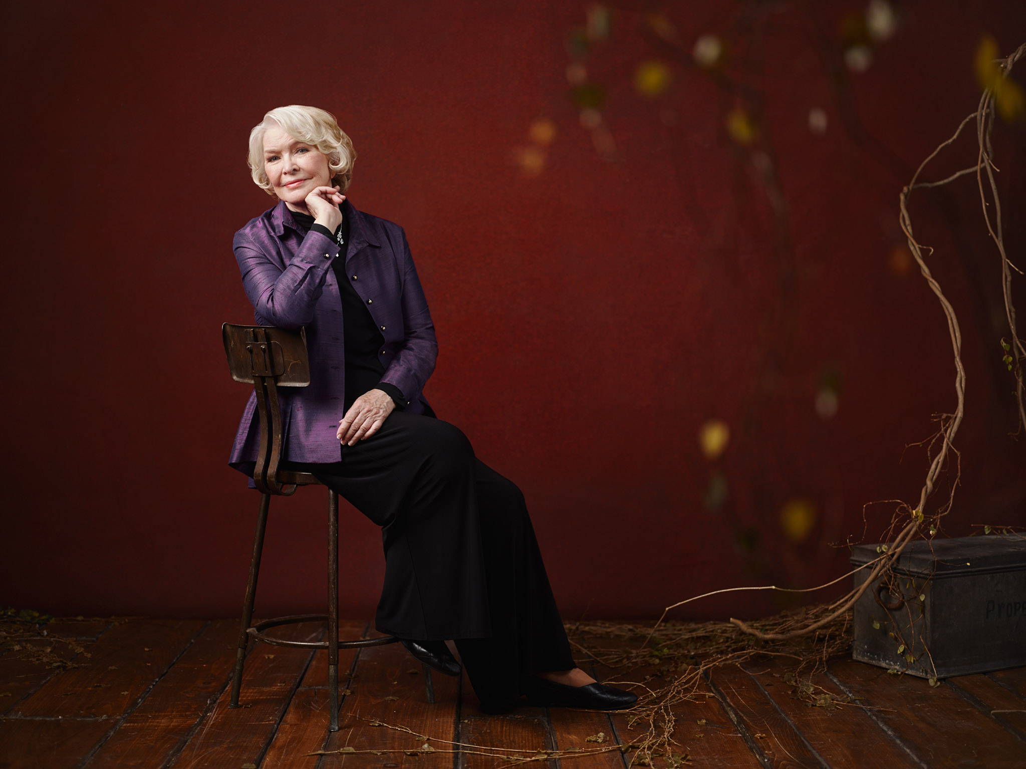
Above: Actress Ellen Burstyn on set
The Shoot
Sometimes shoots come up when you least expect them. This was the case in photographing the key art and press images for Lifetime’s movie “Flowers in the Attic” starring the inimitable Ellen Burstyn. I had been in Milan, Italy accompanying Ms. Summer Rayne Oakes to the 50th Anniversary Celebration of the Pirelli Calendar when I got the call. Sidebar: first tuxedo I ever owned in my life. My usual jeans and sneakers would have gotten totally Gandalfed at the door “YOU SHALL NOT PASS”.) Luckily, I didn’t have to miss any of the main event – and got to meet one of my photographer heroes – Steve McCurry.
After rebooking my return flight, I wasn’t concerned at all about being tired on set. Not even jet lag can take me down when I am in the zone of shooting a creative concept. I was drawn to this job because I admire an older generation of actors and actresses – who not only maintain their passion for film – but also manage to stay relevant in current times and ultimately “reinvent” themselves through the ages. Spanning a career of over 60 years, Ellen Burstyn, is a shining example of one of those impressive talents. Ironically, I was supposed to photograph her months earlier for Screen Actors Guild, but I was away on assignment so this was another fortunate chance to photograph her.
While in Italy, I had a few very late night trans-timezone calls with one of Lifetime’s Creative Directors, Ilene Block, whom I have had the pleasure of working with on other projects. It was Ilene’s idea to bring vines into the key art since a lot of the Flowers in the Attic title treatments had a similar CGI vine-effect “strangling” the titles. It was up to me to interpret her direction and bring this idea to life in the photographs. I gave my good friend, set designer Joe Sciacca, some notes on the look and feel that I was going for. I envisioned a blood red backdrop to contrast the earth-tones of the vines and wardrobe. It would be up to Joe to take it from there – sourcing a variety of props we could pick and pull from as the shoot progressed.
Ultimately this assignment called for two deliverables for the main film poster and press images:
a) Photograph Ellen Burstyn as “herself”, and
b) photograph her “in-character” as the ruthless grandmother Olivia Foxworth.
I figured if we had the vines and other props on set, we could use them in different ways to unite the photographs into one cohesive shoot. In the images of Ellen as herself, the vines could be minimal and just enhance the set. In the photographs of Ellen in-character, we could push things a little further and have the vines actually wrapping around her. This would give us variety but still unite the images under a Flowers in the Attic-styled theme.
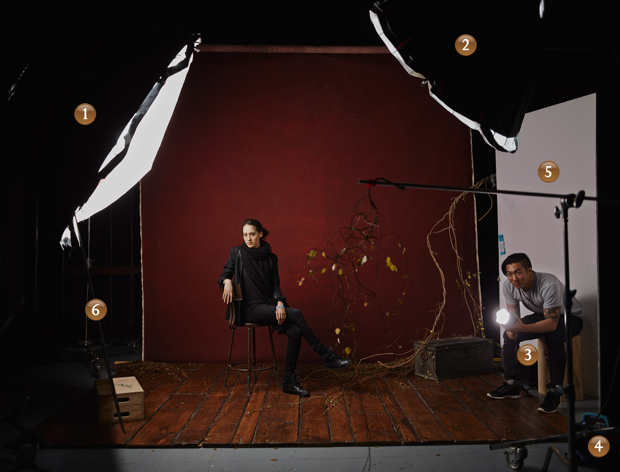
Above: My assistant Celeste stands in for Ellen before the shoot begins. Dave Krysl aims the “gunk-light.”
Lighting Gear List
① Main Light: One Broncolor Para 177 Reflector with a Broncolor MobiLED Lamphead inside
② Fill Light: One Broncolor Para 133 Reflector with a Broncolor MobiLED Lamphead inside
③ Additional Light: Another Broncolor MobiLED Lamphead aiming at the “gunk” in front of the camera lens
④ Power Source: Two Broncolor Move 1200 L Battery Power Pack with Lithium Battery
⑤ White Fill: White Bounce Board (“V-Flat”) to fill in shadows cast from the main light
⑥ Another V-Flat on the opposite side to fill in more shadows
Camera Gear List
Camera: Mamiya 645DF with P65+ Digital back
Lens: 80mm f/2.8 lens
One iPad with Release Me model release app
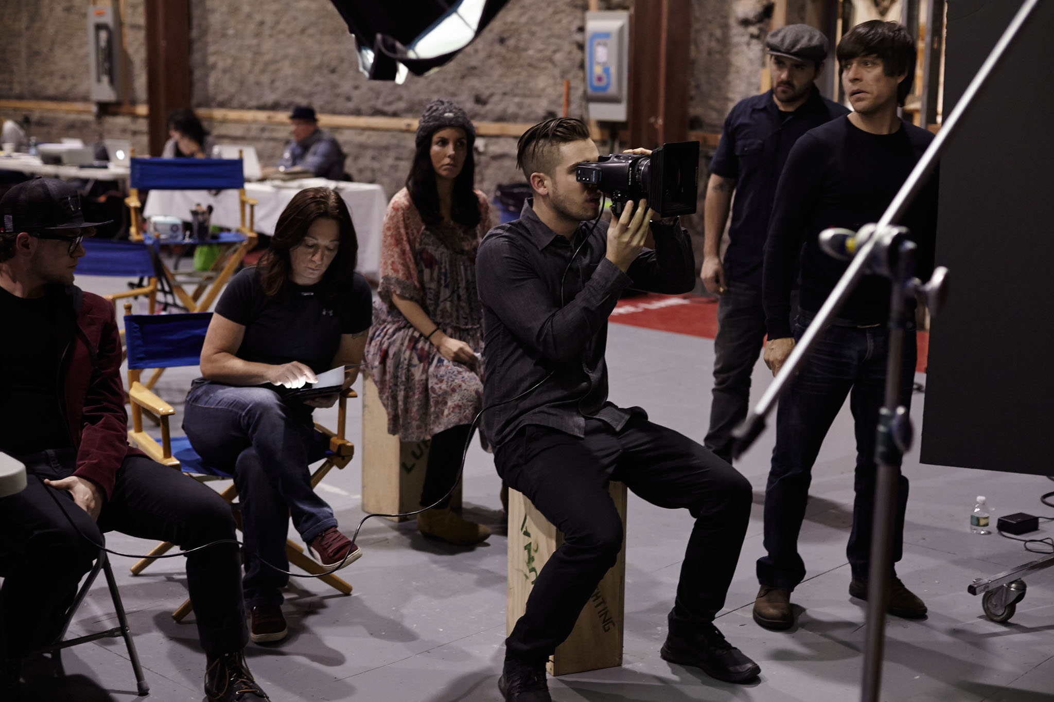
Above: The Mamiya 645DF camera tethered to my iMac. Photo by Celeste Sloman
Make it Gunky
A technique I’ve been experimenting with a lot lately is using different objects in front of the lens to “gunk” the frame. I got inspiration from my friend, cinematographer Khalid Mohtaseb. Khalid does this a lot of this in his own work- often adding glass, mirrors, or props to purposely blur the foreground of the image. For the Flowers in the Attic shoot, my gunk would be the vines themselves. Some images would be kept simple and just have a vine or two in front of the lens, while others were like “a one way ticket to Gunktown”, with several layers of vines surrounding Ellen hung on C-stands. A shallow depth of field such as 2.8 on an 80mm lens was then used to blur the gunk into oblivion and make the textures smooth while providing extra layers of depth to the image. The key is to have the same repeating elements in both the foreground and background, so even a simple set such as this one seems more elaborate and vast.
There are no rules of thumb to follow when gunking; experiment with all kinds of objects, surfaces, angles, etc. and see what works best for the image. With that said, there are some tricks I’ve discovered in my own shoots. One key thing that I did find is having a light dedicated to the gunk itself can help separate it from other elements in the frame. In most of the images, you will notice that the vines in front of the frame are backlit, which allowed the leaves to have a slight glow to them. This was achieved by pointing a strobe with a tight grid at the leaves and being sure the angle of light didn’t flare the camera lens.
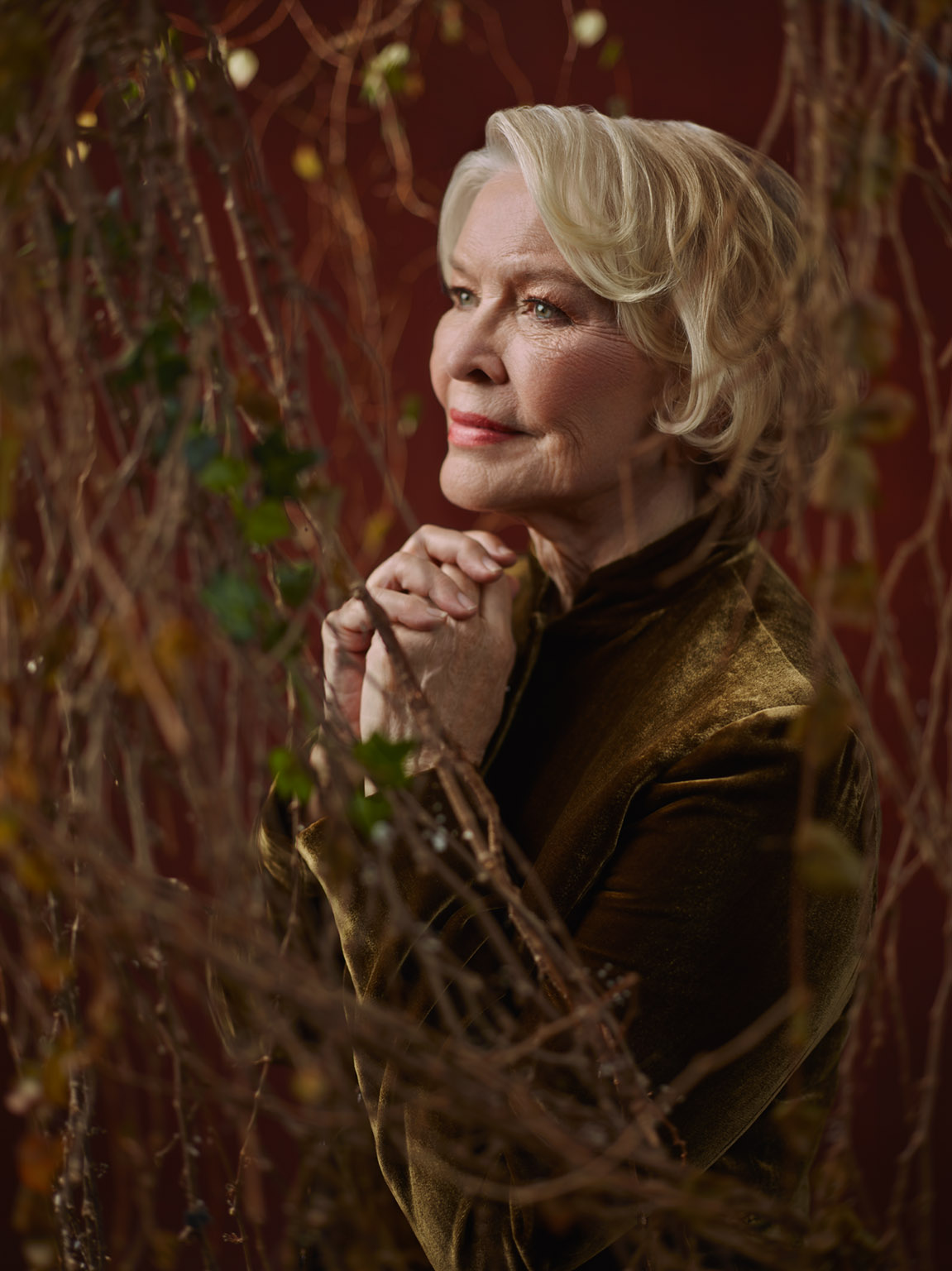
Above: Ellen through some foliage
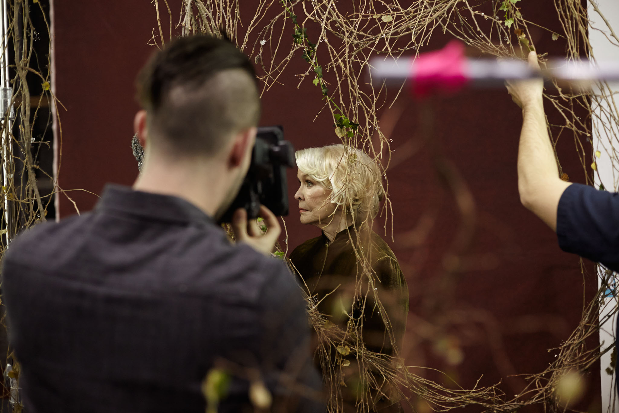
Above: Shooting through a gap in the vines. Photo by Celeste Sloman

Above: Photo by Celeste Sloman
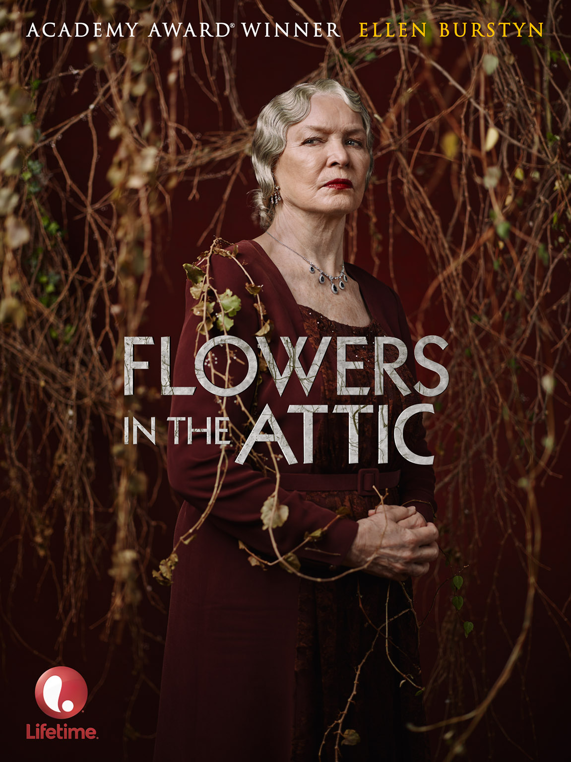
Above: After a warddrobe, make-up and hair change, Ellen is transformed into the sinister Olivia Foxworth
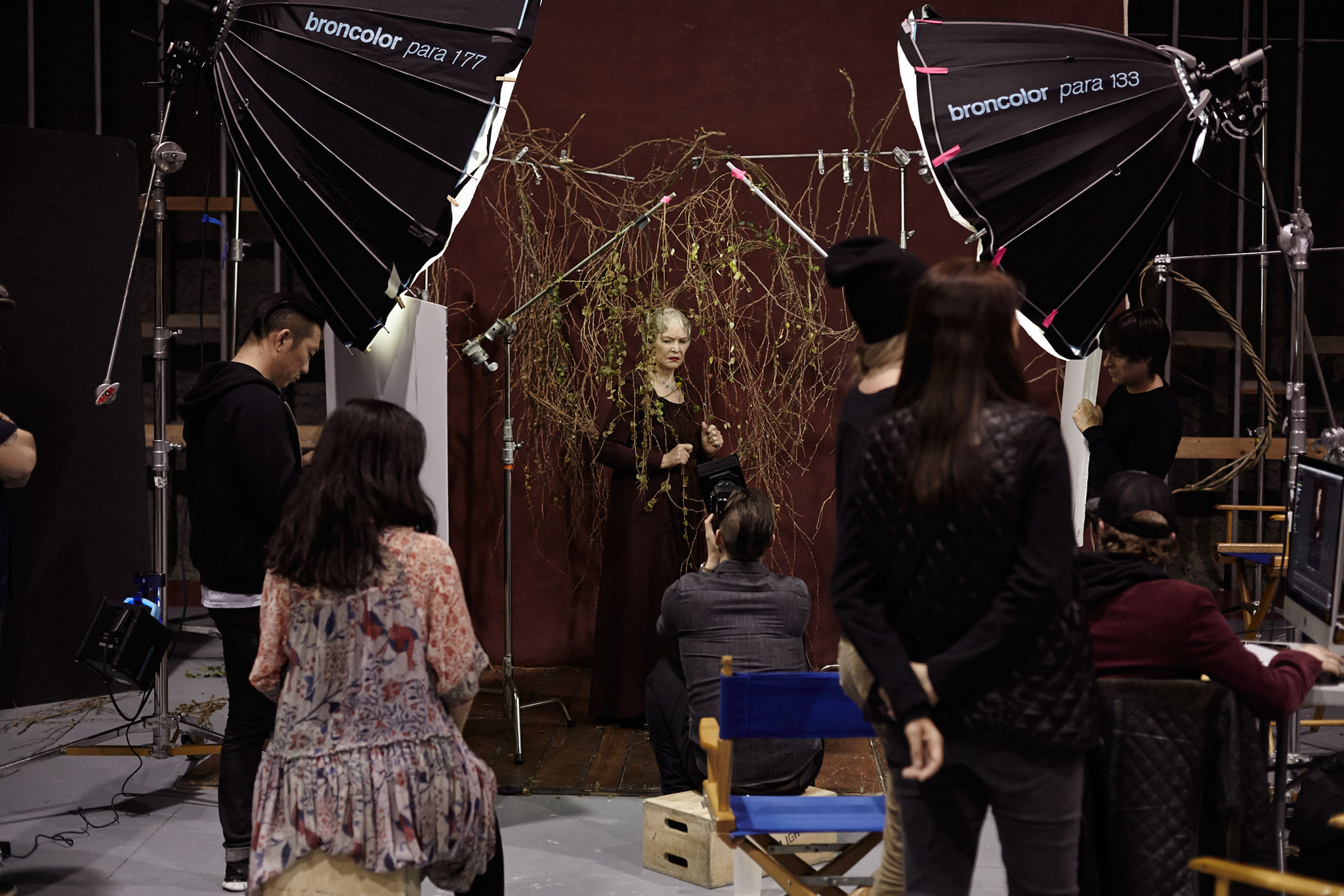
Above: The Broncolor Parabolic 177 and 133 reflectors on set. Photo by Celeste Sloman
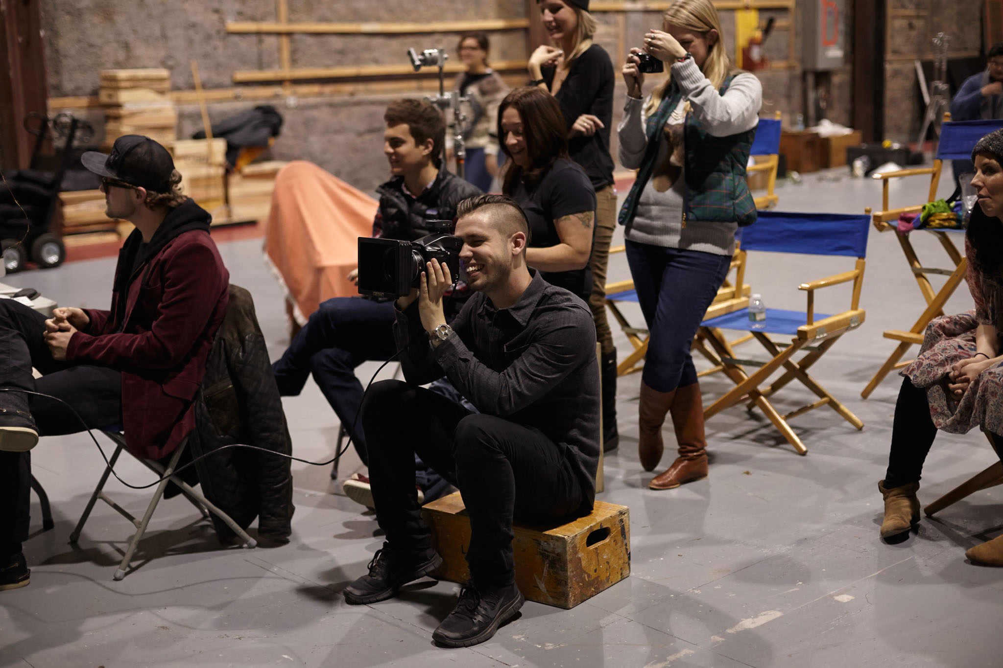
Above: Photo by Celeste Sloman
The Billboard
Every photographer loves viewing their work in print, but it’s obviously a rare treat to see that print stretch across an entire building. When shooting these images, I made sure to take a few different empty “plates” of the set with the vines in different arrangements so that a landscape version of the ad could be composited together and stretched across this building in New York City next to Port Authority.
A common question I get about billboards is how many megapixels you need for such a large image. Although these photographs were shot on a high resolution 60 megapixel Phase One p65+ digital back, I would argue that you actually need more megapixels for a smaller print that is going to be viewed up close, in which every detail and pixel can be seen. When viewing something larger further away, you actually don’t need as much detail.
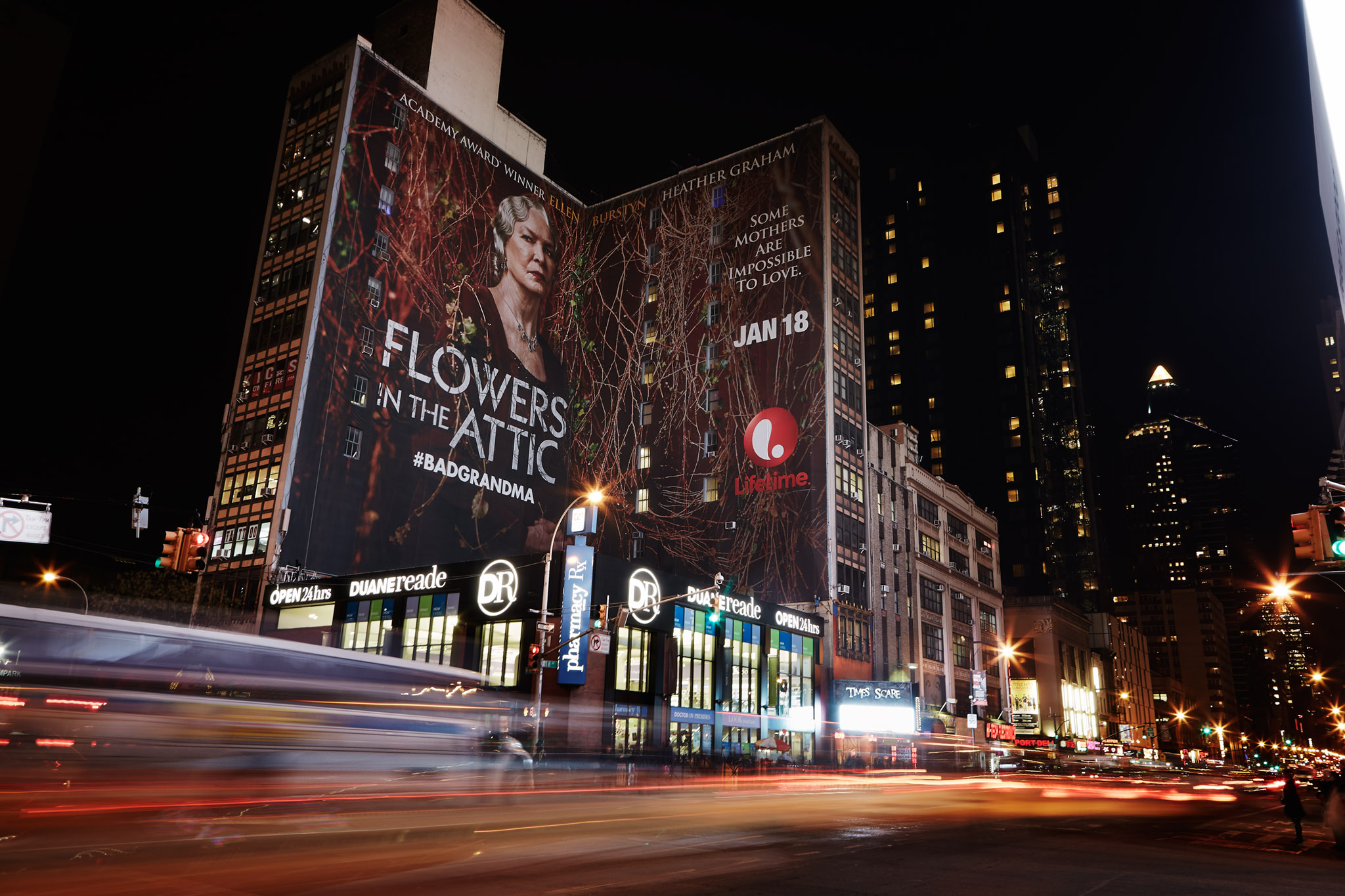
Above: The billboard on the side of a building near Port Authority station, NYC
Although in this shoot I got to photograph Ellen Burstyn’s warm, personal side and sinister in-character side, I must say I do prefer her as herself! During our lunch break, the 80-year old actress remarked, “I want to move back to the city because I’m growing bored living in the sticks. I want some excitement in my life!” This resonated with me because I hope to still be pushing myself creatively at that age. I think we can all take a page from Ellen Burstyn’s book: Focus on the things we can be truly passionate about for a lifetime.

JL
Credits:
Client: A&E Networks / Lifetime
Lifetime: Ilene Block, Joe Nichols, Jennifer Ferguson, Benjamin Asher
mOcean: Peter McKeon, David Kleinman, Candace Reid, Michael Deane
Production Supervisors: Rebecca Siegel & Ariel Rosner
Set Design / Prop Stylist: Joe (Joseph) Sciacca
Lighting Assistants: Hector Adalid, Dave Krysl
Digital Tech: Caleb Adams
Behind the Scenes Images: Celeste Sloman
Hair Stylist: April Schuller
Make-Up Artist: Talia Shobrook
Warddrobe Stylist: Meredith Hudson
Color Grade / Post-Processing: Joey L.
Skin / Hair Retouching: Nick Leadly


ADD A COMMENT (25)
Germán Ruiz // January 17, 2014 04:56
Excellent work Joey, only have a question for you (or maybe for broncolor)... why buy an expenssive gear like the para 133, 177 or 222 if you need to put a difussion material with sticky bands?
Jonathan Menga // January 17, 2014 06:25
The Gunk the Lens technique is pretty sweet. I've tried it a few times. I think you did a pretty dope job. Keep it up
admin // January 17, 2014 06:29
Good question. When we rented these parabolics, they forgot to include the diffusion material. So we stuck some stuff from Elinchrom on there. Sacrilegious, I know... But it did the trick.
Kailash Gyawali // January 17, 2014 09:51
amazing setup and excellent actor merged with excellent team and one my of Fav. Photographer
Joey L you ROCK
Konrad // January 17, 2014 12:14
Great set of images, as always, and kudos to Celeste for awesome BTS work!
Mark Holland // January 17, 2014 14:13
How long did you get to spend with Ellen? Was the 'moving of the gunk' all rehearsed beforehand for each of the different shots or was it more relaxed?
laura Radford // January 17, 2014 17:34
Okay I'm sold I'm going to buy your tutorial. You're work is just sweet!!
Tobias // January 17, 2014 19:05
Hey Joey,
nice work :)! which typ of diffusor did you use? are these the orginal from bron?
cheers T
Gene // January 17, 2014 22:36
First time hearing the name 'Gunk the lens' given to the technique of using a blurred foreground to frame the subject and support the theme, but it is an important one to learn for everyone expanding their photography tool-set - glad you are teaching it to your students, regardless the name! Good final photo, btw, and congrats on the billboard - it is always great to see one's work in print, big and small!
John Evans // January 18, 2014 04:29
Always excited to receive Joey L's blog post!! Always a winner and so full of tips and advice from the best photographer of the 21st century! Your work is so cool Joey! I am continuing to get the most of a learning experience from you and hoping you all the best! You have me looking at 645's now instead of 35mm. Must be exciting to work with. Thanks again Joey L!!
Holger Feroudj // January 19, 2014 06:00
Fantastic read, thanks so much. By sharing this we can all learn so much, you rock.
Marian Majik // January 20, 2014 01:59
Beautiful work Joey I love the last portrait but street with billboard is pretty impressive too. M
Stephen Walcott // January 20, 2014 16:00
I'm always loving the wood floors you use for your shoots. Do you have set designers to build them for you or can you rent them pre-built if that makes any sense?
Mary Ann W. // January 26, 2014 04:46
I love reading about the shoots you do, I wish you posted more often! Love the look and color of this shoot, you aways seem to have very earthy tones in your work. Thanks for sharing the experience.
Quoi de neuf en ce lundi matin? [57] | Marc Charbonnier // January 27, 2014 14:58
[…] L’astuce de Joey L. pour créer des compositions originales: placer des objets dans le premier plan. […]
Linda // February 06, 2014 06:42
So good. I read that story when I was younger and it was extra exciting to see this shoot and what you did. This is also a mildly ridiculous question but your assistant is wearing what looks like the most comfortable shoes. I'm on my feet all day shooting - what is she wearing?
richard.l // February 08, 2014 00:56
i like the crew credits...
particularly with links to their work.. very nice
Elaine // April 13, 2014 21:34
I am very partial to that last shot of Ellen, it just seems to capture her and her personality very well.
Amir // July 28, 2014 16:06
Awesome Work.
The billboard is breathtaking.
Beautiful set and stunning actres.
Greetings from Austria.
Mark // December 24, 2014 10:18
Congrats on the billboard print Joey - that must have been awesome to see in real life!
Tomek Toroj // November 23, 2015 12:29
Outstanding photos; young and wise photographer.There's no need for anything more.
Nick del Costo // May 29, 2016 19:33
God she's becoming more beautiful with every passing year. Ellen Burstyn is really a true example of a woman getting better with age! Exceptionally captured by Joey L.
most companies // November 28, 2016 14:35
beautiful woman. I really like your work so that each of them is alive, not as on the covers of magazines
custom essay service // December 22, 2016 01:24
Fantastic photos. Model looks great. Unbelievable emotions in these photos. I am delighted with your work.
Paulo Dasilva // November 10, 2017 18:29
Outstanding work Joey, I love the portrait of Ellen through some foliage
Your comment has been posted