PERSONAL WORK, PASSION, YADDA YADDA YADDA
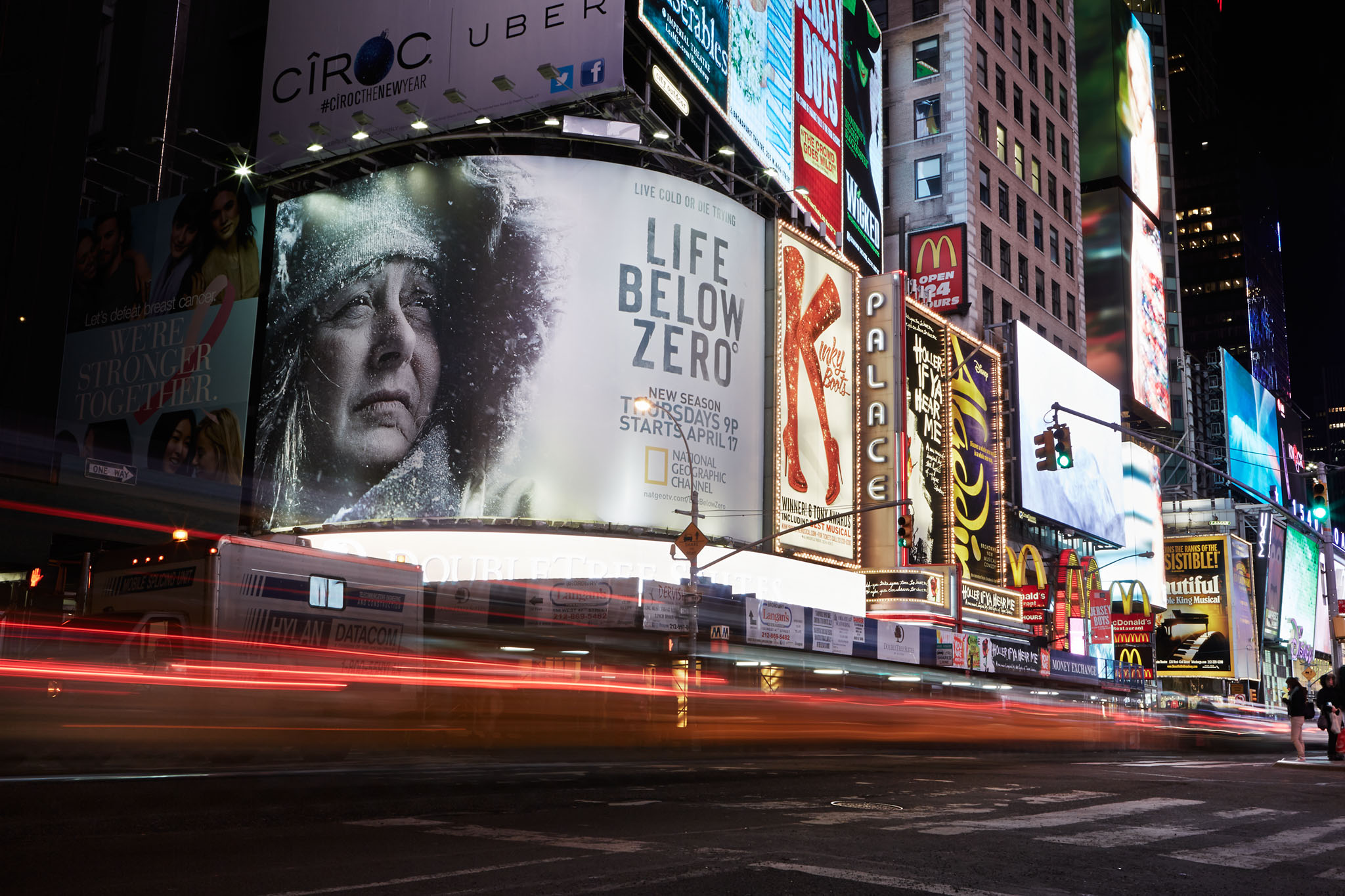
If we as photographers envision the internet as an ocean, and every fish a new set of eyes on our work, then we can view every new photograph in our portfolios as another net in that ocean that can lead to a new assignment. Sounds like bullshit, right? Well, it’s not. It’s the way the photography industry is changing. In this blog post, I’m going to explain the strange, peculiar way that I came to photograph the print advertisements and billboards for National Geographic Channel’s "Life Below Zero".
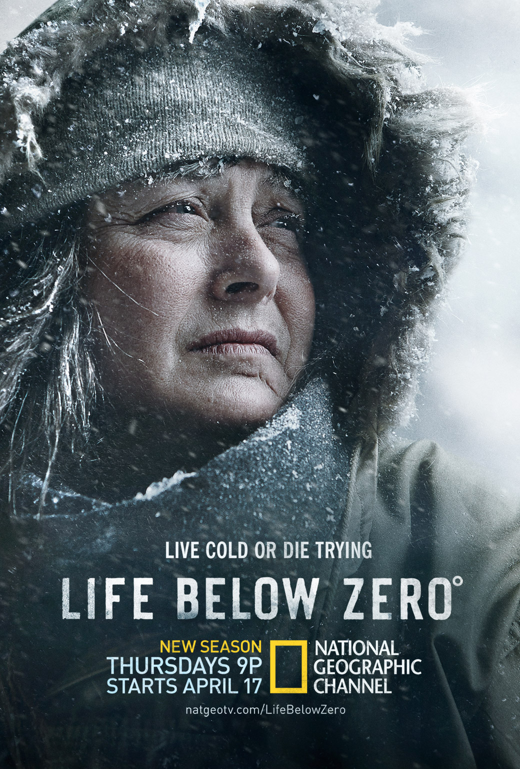
Above: Final key art for Life Below Zero designed by Cold Open
PUSHING FORWARD
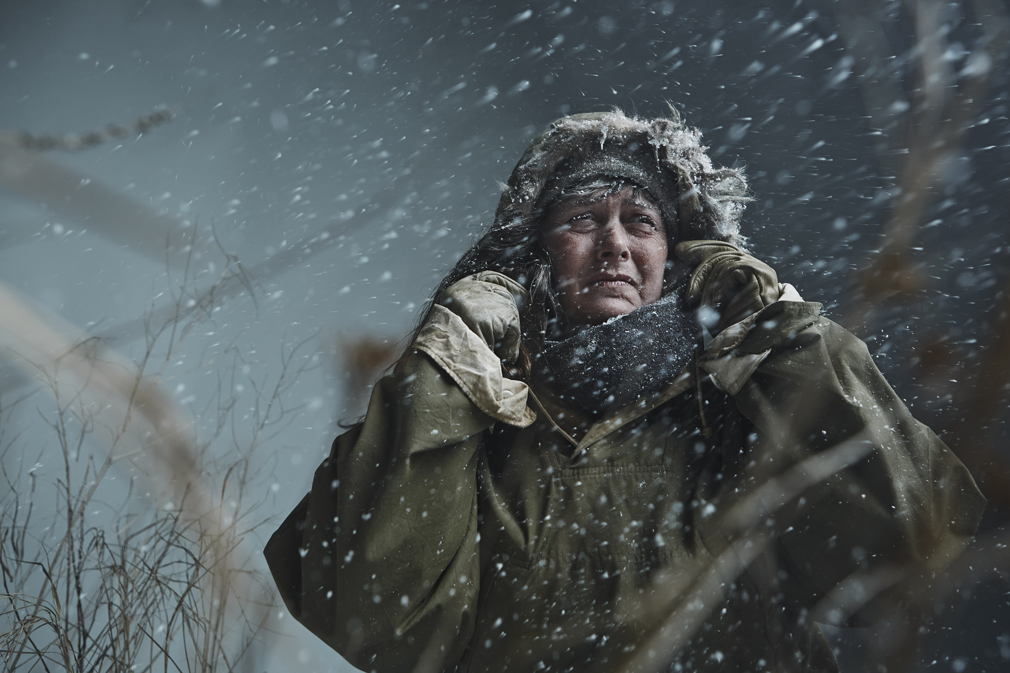
Even though I had done a similar shoot before inside an artificial blizzard, we didn’t want to recreate exactly what had already been done. Besides, where’s the fun in that? Andy at Nat Geo wanted to push things a step further. We would use my initial images as a starting point, but steer the look and feel more towards the show. On creative calls, Andy explained that the show feels colder, darker and less polished than my initial photographs:
“I like the other blizzard images you shot before but they are a bit too… Hmm… Snow-Globey? Does that make term sense? Am I being too client-y here?”
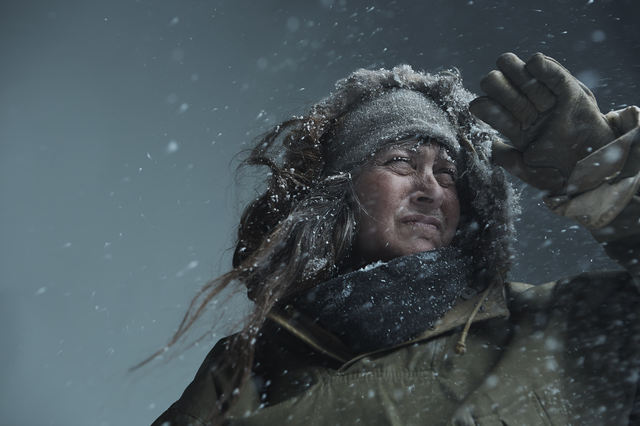
I have to say this is the first time I’ve ever heard the term “too snow-globey” but it made total sense. When it’s extremely cold, snow is not puffy and large. Beyond making the light more dramatic and less feathered and soft, something as simple as reducing the size and speed of the snow flakes themselves could even change the feeling of the photograph.
If you’re interested in more of the technical data about these photographs, that info can be found already described in detail in my previous blog post "Creating an Indoor Blizzard".
SUE AIKENS: PROFESSIONAL BADASS
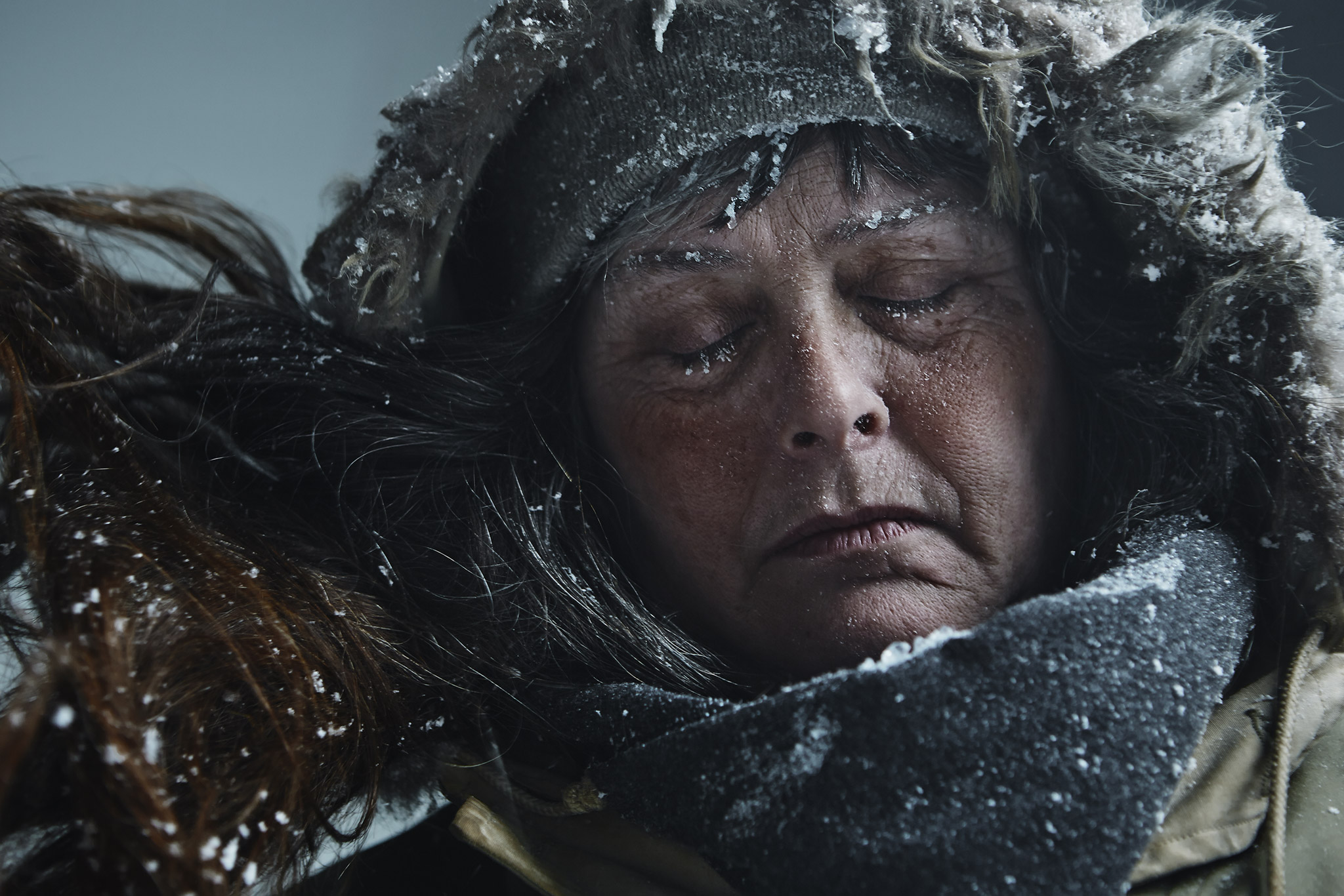
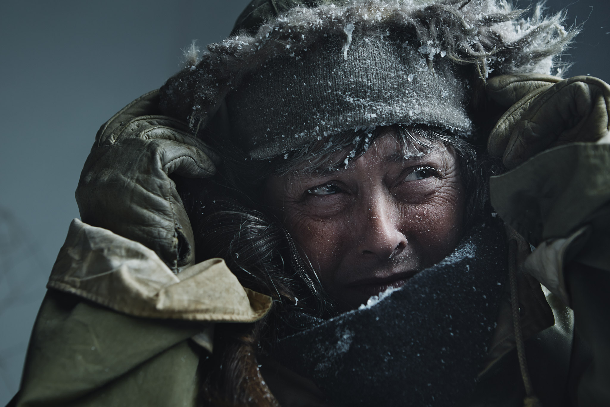
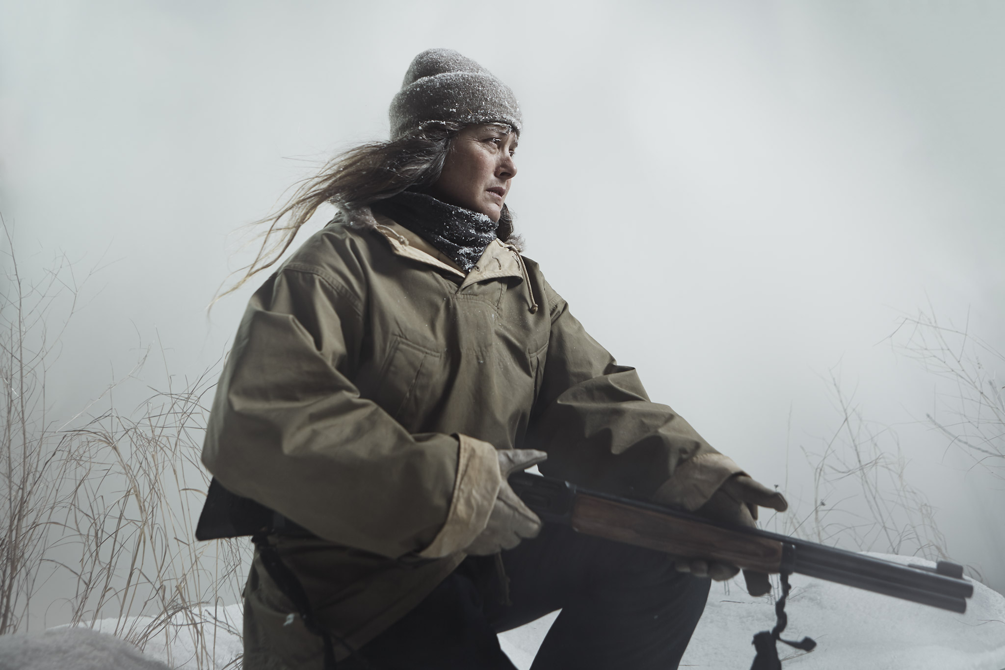
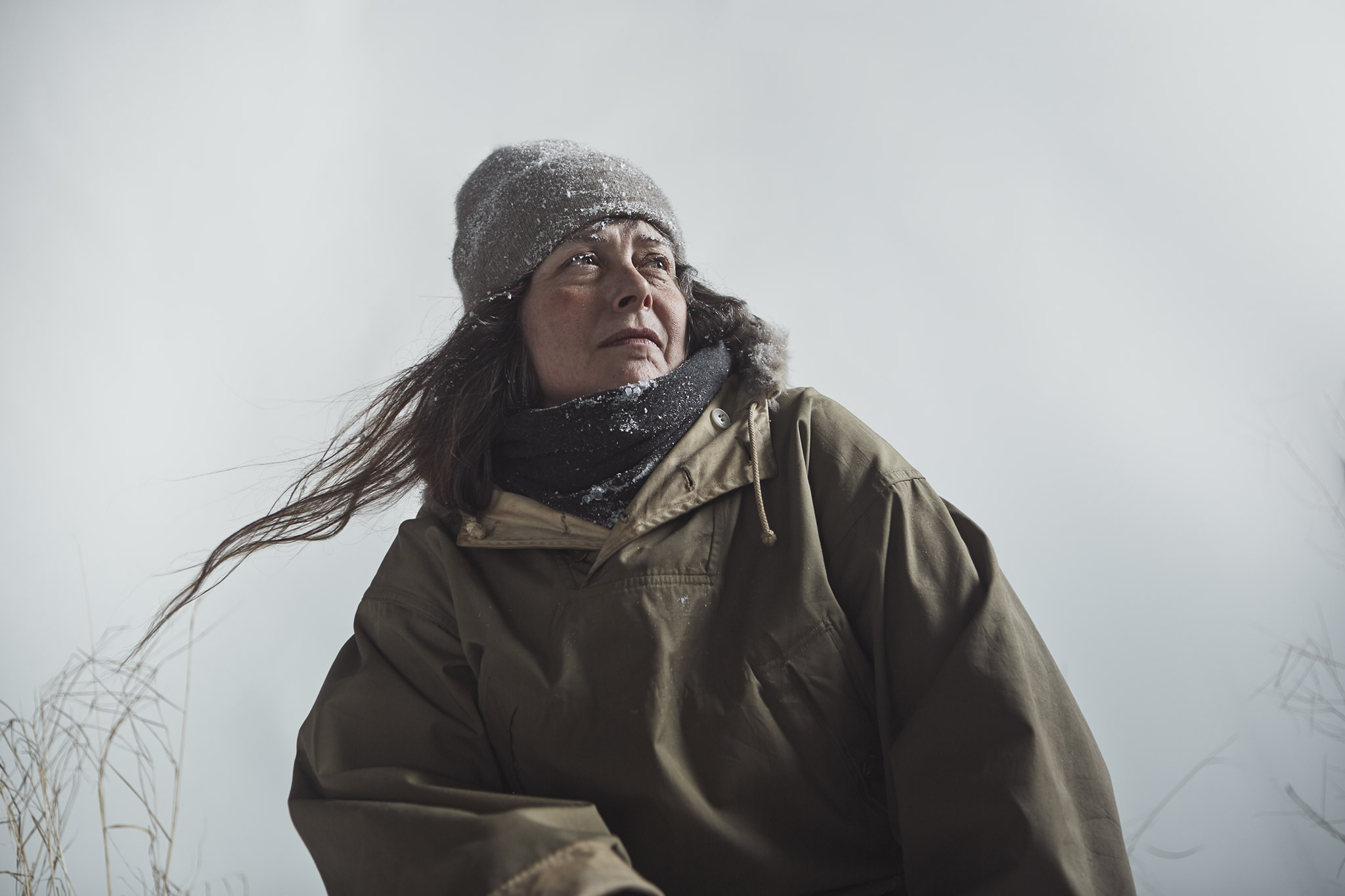
I give major kudos to both Cold Open and Nat Geo for having the integrity to feature one of the real subjects in the show on the billboard- Sue Aikens. Sue is the warden of Kavik Camp- a remote exploration camp miles North of the Arctic Circle, 500 miles from the nearest city and 80 miles from the closest road. Sue lives in isolation for 9 months out of the year. When she’s not alone, she hosts geologists, climate scientists, eco-tourists and occasionally has to provide security for them against the plethora of dangers that disturb the campsite, including Grizzly bears. An early episode of Life Below Zero shares a story of when Sue was mauled and attacked by a grizzly, clawed and bitten in the head, and narrowly escaped death. Let’s just put it this way- Sue is one true badass.
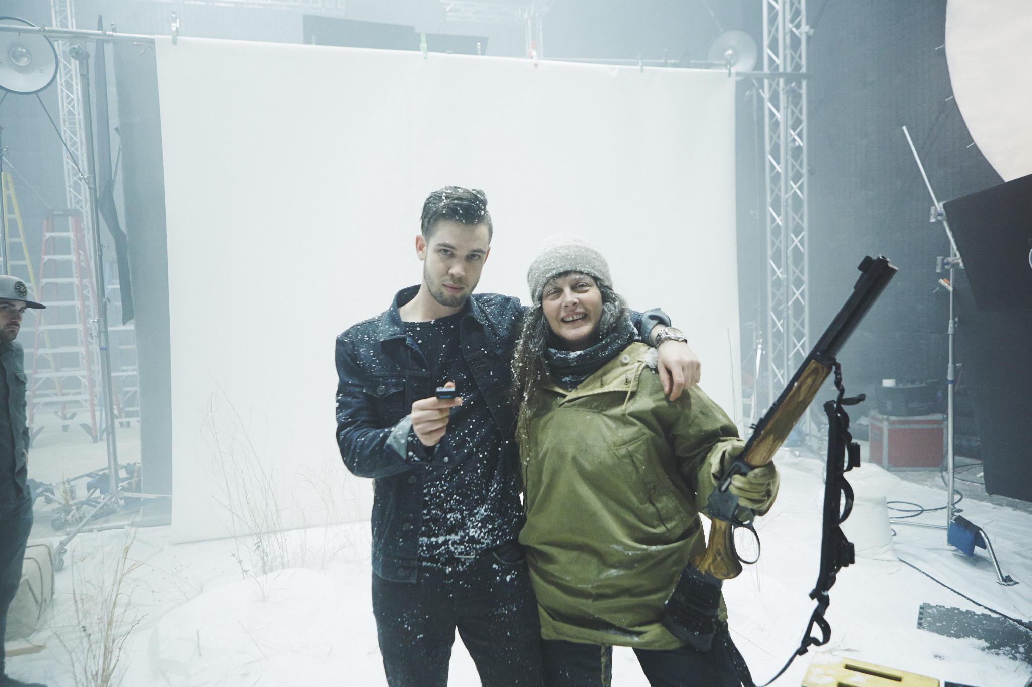
Although I think Sue is actually quite beautiful and charming in real life, the image of her chosen for the main key art isn’t exactly flattering, but it is honest in representing exactly what the show is. Sue didn’t mind this either, and would rather be depicted authentically as someone facing a harsh climate rather than “a girly-girl with a pink rifle”, as she put it. But that doesn’t mean Sue is all things serious- she loves to joke around and is a delight to work with. Beyond technical knowledge and artistry, I belive that portrait photographers need to develop social observational skills. To make someone comfortable, you have to be able to read the nuances in an individual’s character and express your ideas in a way that will make sense to them. Sue is a lovable person and easy-going, but this is still the first time she’s done a photoshoot like this. She hadn’t met us previously. So- even with such a large personality and confidence, how could Sue not have an inkling of uncertainty about our intentions? She is human after all. Because of that, we had to be sure she knew our minds were in the right place to depict her with authenticity. We listened to what she had to say and made her part of the creative process . We did our research by watching episodes and reading material about her life, we took recommendations on what she’d actually wear and even the way she’d hold certain props or objects. It was also helpful we both love the movie Kung Pow: Enter the Fist… That certainly broke the ice.
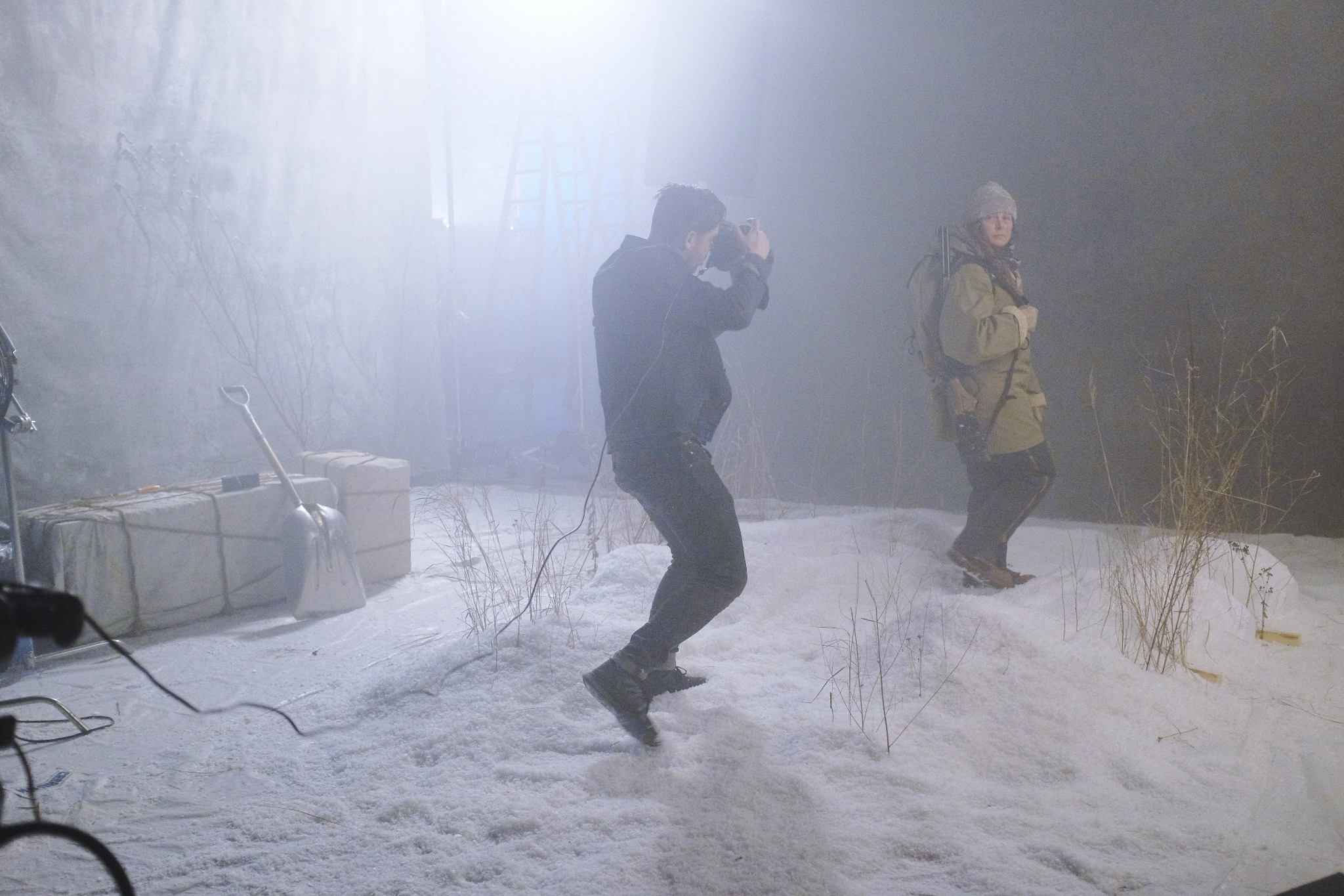
Rather than have our crew travel to Kavik, an incredibly tight deadline made the shoot happen in Anchorage, with Sue flying in. Joe Sciacca's awesome set design brought the icy feeling of the show to life. I feared Sue would think we were total phonies from Hollywood because she lives the real thing every day, but she was really into the concept and collaborative. I’d photograph her again a couple weeks later in NYC while on a press circuit promoting the show.
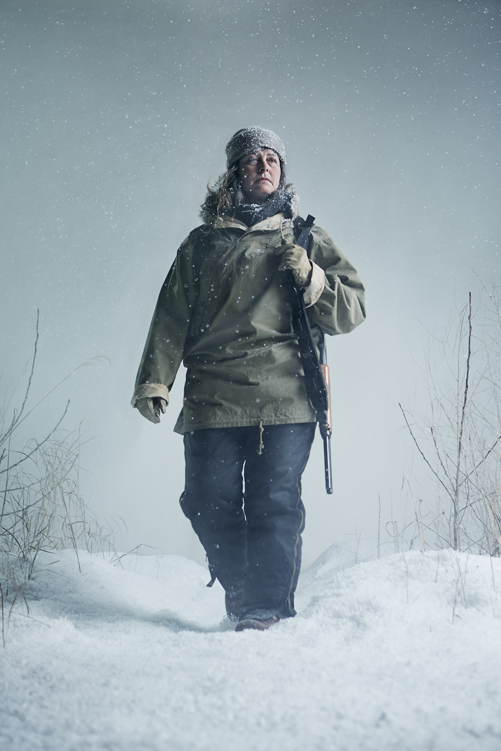
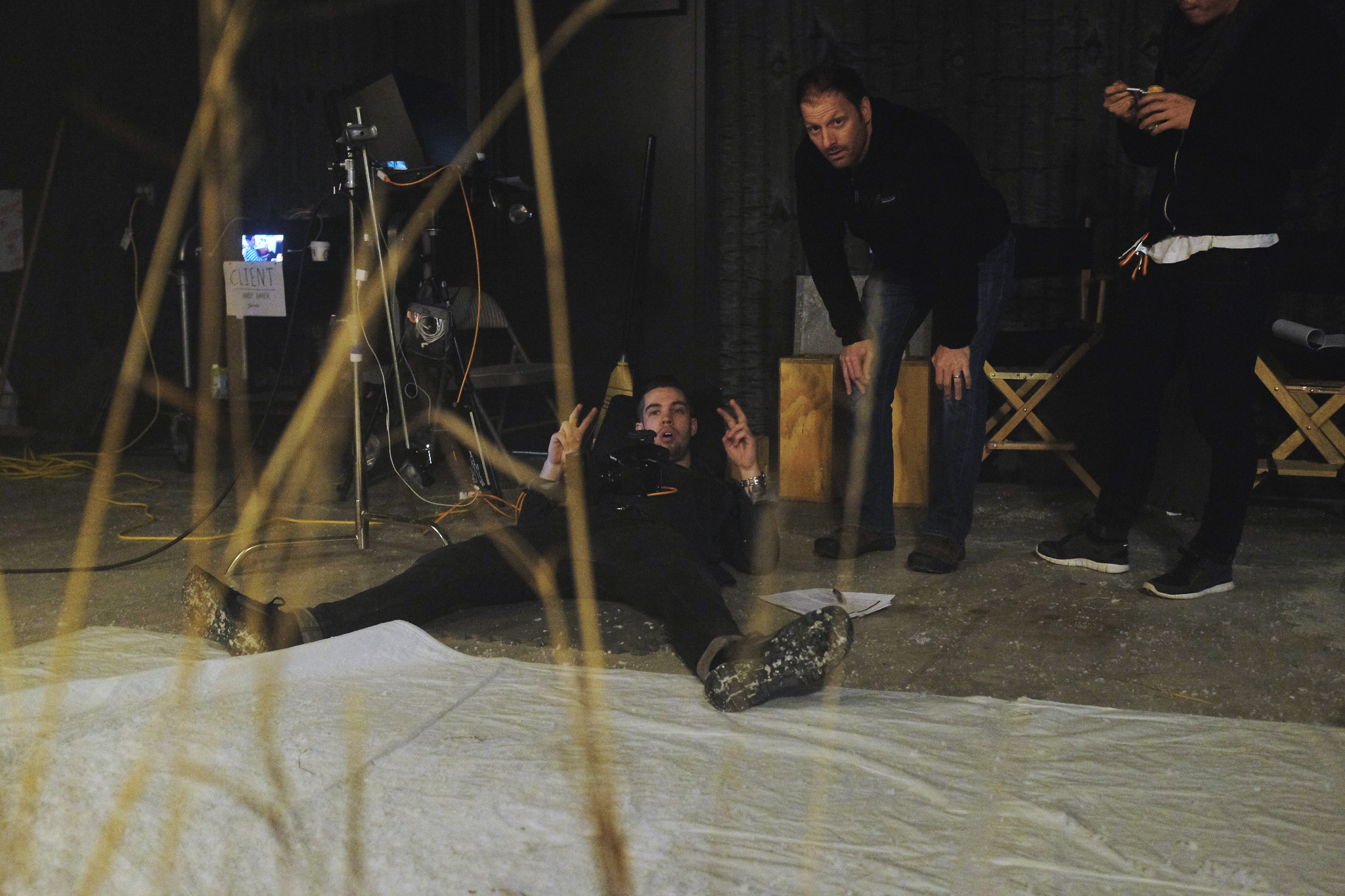
Above: "LASER"
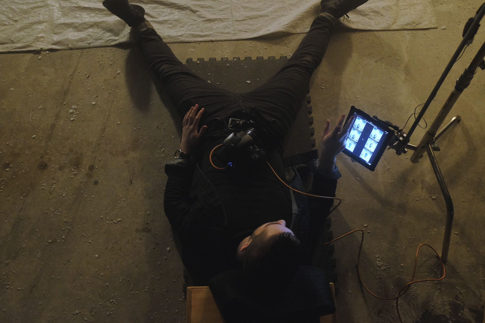
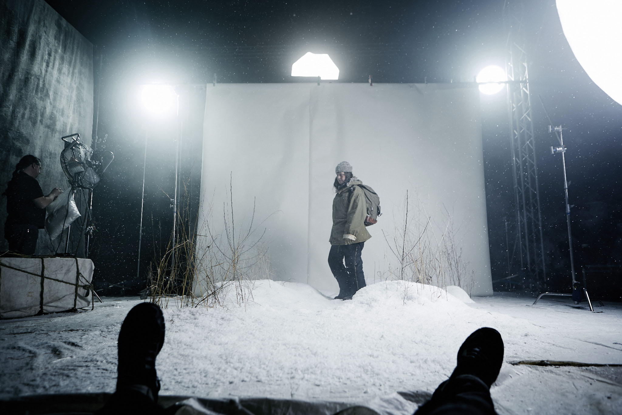
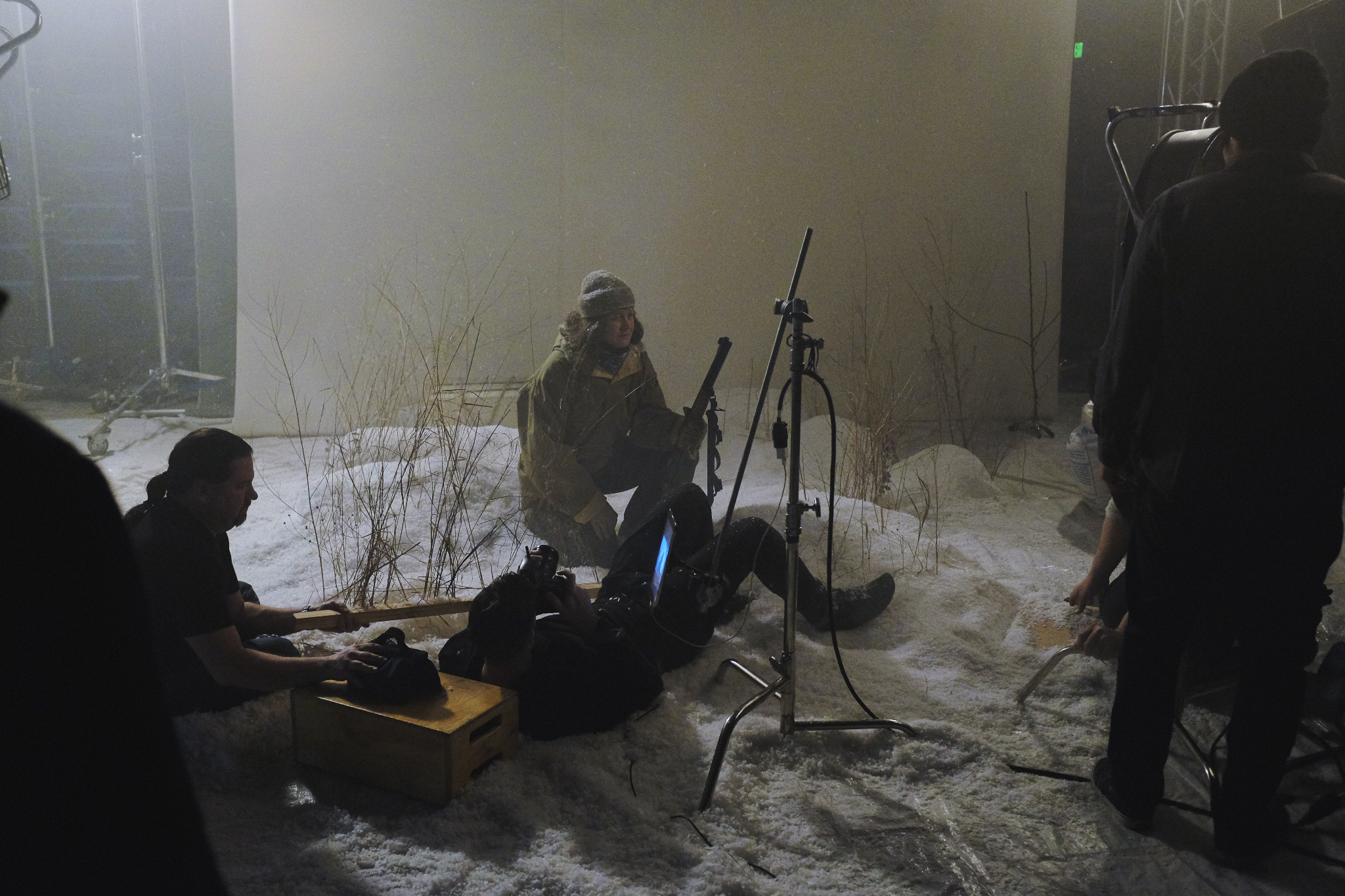
Above: After looking at the behind the scene images, it seems I did 90% of this shoot laying down
THE FACETIME CLIENT
Andy wasn’t able to join us for the shoot, so he tuned in via Facetime on my iPad. I don’t have to go too into depth about this because Andy has written an entire post about working with our team on this shoot remotely on his own outlet: The Client Blog.
Andy explains: “During the day, I left the Facetime screen on my desktop and muted the microphone while I was doing other work, having meetings, etc – and occasionally I’d see Joey or Gardner (Creative Director from Cold Open) waving to get my attention and we’d pow-wow quickly. Everyone from my team stopped by to look in at some point and watch the shoot, and marveled at the simple solution to “be on set” from 3,000 miles away. Mostly, I just really appreciated everyone on-set in Alaska making such a great efforts to involve us in the shoot as much as possible. I tried not to interfere at all in the process, and in the end it was a great way for them to get immediate approvals and feedback rather than working more in the dark.”
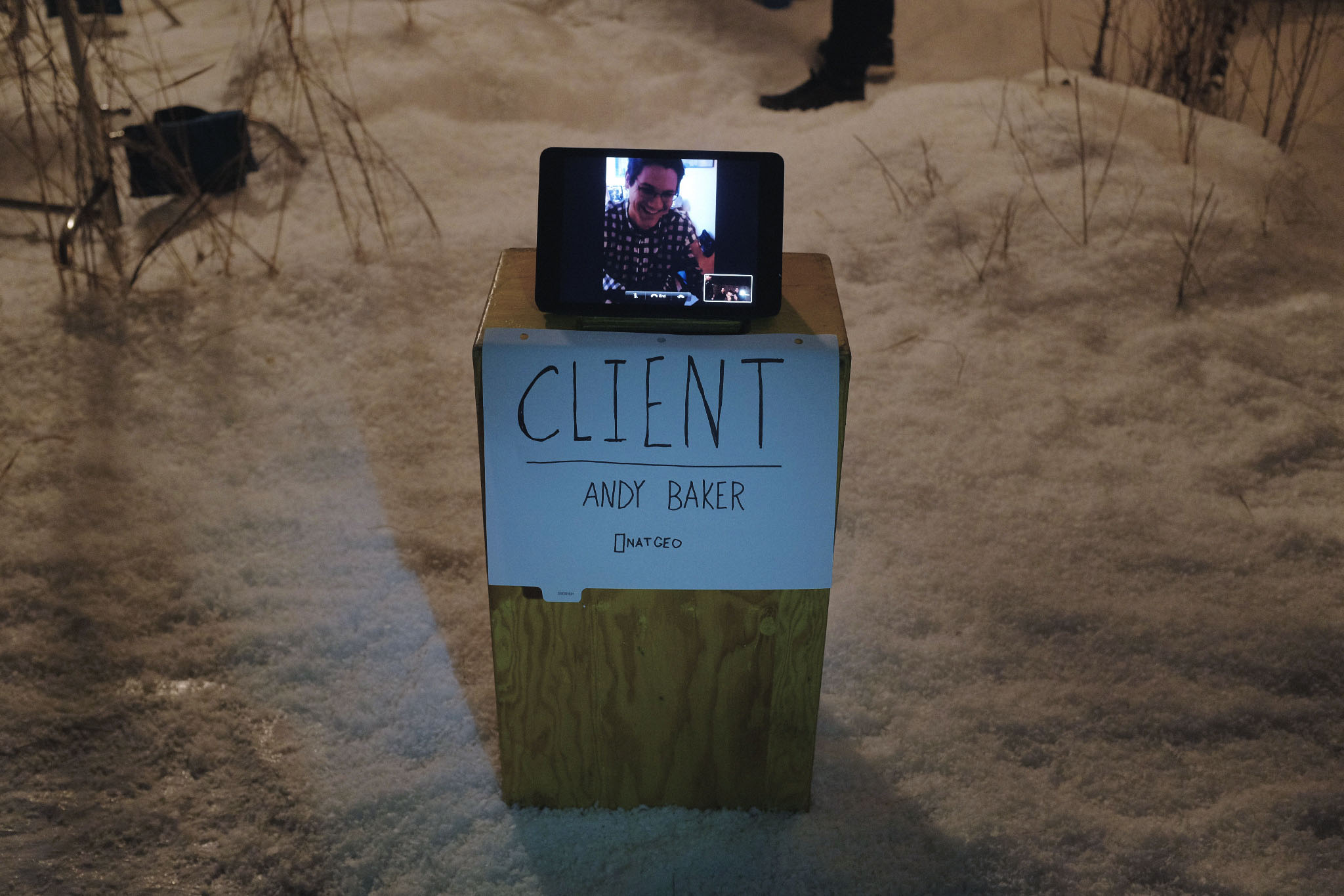
Above: If the client gets too clinet-y, we can just turn him off.
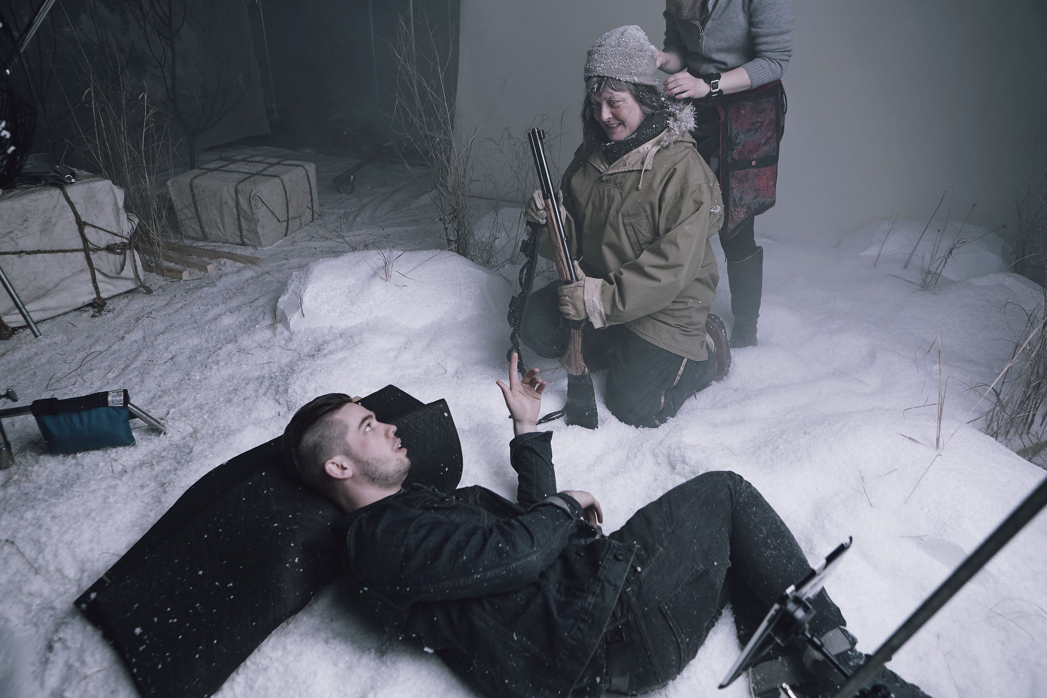
Above: I learned that both Sure and I are fans of the movie Kung Pow.
Now, I’m not someone who follows to the new-agey nonsense of cultish films like “The Secret”, but I do really believe that the thoughts and things you put into the world can manifest themselves in a variety of ways. This shoot happening gave me another reason to believe that simply putting your work in front of countless eyes can yield results. In today’s rapidly changing industry, it appears that sharing is just as important as shooting itself.
JL
ADD A COMMENT (39)
Justin // April 15, 2014 04:38
So awesome. What are you using to view your images on the iPad...if you don't mind me asking?
admin // April 15, 2014 04:40
Justin- it's sync'd using Capture Pilot
Mike // April 15, 2014 04:54
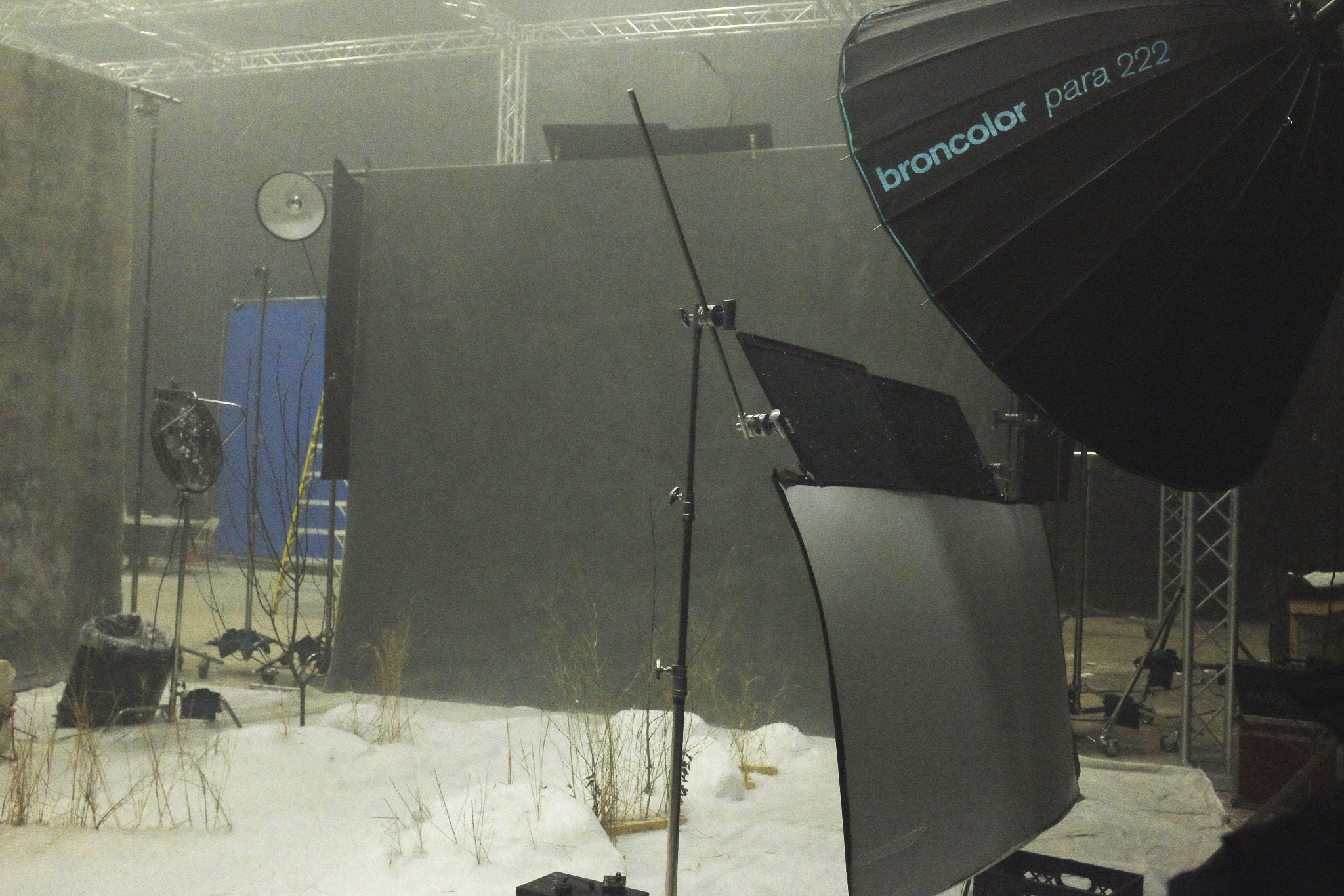
Was it a challenge getting all the gear up to Anchorage? I don't imagine their is a local rental house with trusses, C-stands, wind machines and a Para 222?
admin // April 15, 2014 05:20
Mike- I brought my own lighting gear, but the grip was rented locally.
daniel // April 15, 2014 05:28
Joye's photos never fail to be amazing, but what I love the most about him and his work is what he began this blog post with: sharing, I've learned from him, by looking to his images, and then finding out about the lighting techniques etc. I admire him, I respect him and he seems like a really cool guy, he's accomplished so much at such a young age (I'm just a couple months older) keep up the great work and the awesomeness.
From Colombia.
daniel cely // April 15, 2014 05:32
Joey's photos never fail to be amazing, but what I love the most about him and his work is exactly what he began the blog post with: sharing. I've learned so much from him just by looking at his images and then finding out about the lighting techniques etc. it's amazing how much he has accomplished at such a young age. keep up the great work and the awesomeness
Ken // April 15, 2014 06:41
Joey, I learned of your work through "The Fro" episode and that surely impressed me. Kudos to Jared for having you on the show and spending time discussing your work. After watching that show I believe is where it pushed me to redesign my website. I am still building it, but I will certainly add your page to my website as a suggested person to follow. This being my first time reading your blog, and having recently followed you on Twitter. Which brought me here. Thank you for your time in sharing your world, your art and how you create.
Jason Grover // April 15, 2014 07:37
Nice work Joey. I have to say living in central Canada where it is -30 to -40 for weeks and weeks, you nailed the set 100%. Looks like the real deal.
Lee Love // April 15, 2014 07:54
Joey, great story and nice work (as usual). I believe your approach to shooting personal work and to sharing is right on target.
John Archer // April 15, 2014 14:25
So inspiring and thank you very much for sharing Joey.
Jason Hardesty // April 15, 2014 19:30
"What do you get when you cross an owl and a bungee cord?…"
Sally Wanless // April 15, 2014 19:43
Nice blog Joey! great to see the images from the shoot. Loved your workshop on CreativeLIVE for the snow blizzard, just goes to show how important personal work is!
Geoff // April 15, 2014 21:59
Great words. Great work.
Chris Renton // April 16, 2014 00:05
Thanks for sharing Joey. Must be a great feeling seeing your work on a HUGE billboard in Times Square!
James // April 16, 2014 00:13
Amazing work again Joey! Totally inspired man...
Ellyn // April 16, 2014 02:25
Your ideas about sharing are refreshing-very well said. Beautiful work!
Laura // April 16, 2014 14:08
I friggin love your blog posts - you don't hurl them out every day so when it does pop into my inbox I'm beyond excited to see what you've done next!
karl johnston // April 17, 2014 03:10
I think you nailed the look really well of representing someone in the cold arctic climate, the snow looks realistic and I would've thought you were up in my territory, on the land, on a back trail somewhere. Sue's look is one I've probably had, gazing out into the harsh -40c wind
Derek M // April 22, 2014 04:05
Did you switch from Profoto to Broncolor? If so do you mind giving your reasons why? I know you were I big fan of the profoto gear.
Thanks
-Derek
Amber @ Tether Tools // April 22, 2014 17:56
Joey - fantastic post! Great to see you utilizing the Tether Tools Connect Lite and Wallee Case holding the iPad making for a seamless workflow with Phase One's Capture Pilot! Well done! Love the images!
WELS #02 - Migu // April 25, 2014 17:18
[…] SHARING IS JUST AS IMPORTANT AS SHOOTING Making of eines NatGeo Fotoshootings […]
admin // April 25, 2014 22:08
Derek M- Nope, I didn't "switch". I am not loyal to any specific brand. I just use whatever is best for the job. I'm a fan of the Broncolor parabolics, and it was a perfect tool for this project.
adam // May 01, 2014 19:49
Hi Joey, Amazing photos. I notice from your behind the scenes photos and your tutorial videos that you don't use fill lights a lot. BUT your shadows don't ever see to go fully black. Whenever I shoot with one light the shadows get lost. Do you have any tips?
Jodi // May 02, 2014 03:59
These photos are incredible. I love how you share so much information and the fact that you find establishing relationships with subjects important. It is very refreshing to not only hear about the technical aspects of photography but the personal and creative. Very inspiring.
admin // May 02, 2014 23:31
Adam- Light position, using larger / softer light sources, or balancing more subtly with the ambient light will all help.
Mary Ann Wamboldt // May 09, 2014 00:58
Out of the social media sites that you use, which one do you find to be the most effective with respect to sharing your work and receiving requests for work?
danny // May 22, 2014 23:52
You were in Anchorage and I missed it ): big inspiration
caris // July 02, 2014 16:26
hi Joey, I just shared Beyond with a friend going to India and after watching it again, almost crying again for the beauty of it, because I lived in Varanasi many years and know how you felt standing on the bank of the Ganga...thought I'd check out your recent stuff.... your sharing goes deep... and the picture of Sue with her eyes closed... wow....... you have a special gift of relating....... it's not just the photos
I love your work
caris // July 03, 2014 01:41
hi Joey.. I just shared Beyond with a friend going to India for the first time. I watched it again myself and having lived there for many years I nearly cried when I saw your expression when you saw the Ganga on that first day, like you had come home. Your sharing is perhaps deeper than you realize. In this series, the photo of Sue with her eyes closed is amazing, heart-stopping, almost like peace in death, or beauty in suffering in the Japanese sense. You have a very special gift of relating, along with your other skills, thankyou so much for sharing yourself.
Michael Creagh // August 20, 2014 08:25
Truly amazing set up. Thanks for sharing.
Jaime // July 12, 2015 19:02
Amazing, love it, thanks for sharing!
Smit Kulkarni // October 10, 2015 04:02
Hi Joey,
I must tell you that you do amzingly awesome work. I would love to learn from you but I just can't afford the kind of gear you use. Any suggestions on how to start off and get better would be great.
Thanks in advance.
Smit Kulkarni @ Dphotographer's
lynn // May 13, 2016 20:02
Admin, if not okay please remove!
Our facebook group “selfless” is spending this month spreading awareness on prostate cancer & research with a custom t-shirt design. Purchase proceeds will go to cancer.org, as listed on the shirt and shirt design.
www.teespring.com/prostate-cancer-research
Thanks
Lee // June 26, 2016 18:57
Sue Aikens looks gorgeous in the photos. You've done amazing work capturing her strength and determination and she looks awe inspiring. It might not fit the conventional standards of "flattering" since she's a woman and society typically expects a more glamorous look, but there's a beauty in a strong, powerful character and we need those images of women to be captured too. Glamour portraits are pretty and all, but this stuff has power.*
If National Geographic had wanted her to look any other way (or just skipped over her for someone younger and prettier by conventional standards) it would have been a mistake. Maybe not an unusual one, but certainly a wasteful one. Excellent work.
*(Nothing wrong with glamour shots of course, I just find this stuff more powerful.)
furnish your office // July 14, 2016 10:05
furnish your office https://www.roomhints.com/
Zoltan Bese // April 06, 2017 01:11
Lata your works last 10 years.
You still exciting.
Thanks
visit this page // July 30, 2018 08:05
So exactly where would you start? First thing you certainly can do is begin off out
incorporating regional into your keywords and phrases. A fantastic illustration would be if you are available
essential oils, your own keywords can be"essential oils," or"high quality essential oils." Now you wish to
introduce nearby, so you can turn your keyword to some long tailed
keyword using spot, such as for instance"essential oils London" or even"essential
oils in New York" as illustrations.
Your comment has been posted