I am often asked about how much I am involved creatively in my photo shoots. Which of the ideas come from me, and which come from art director’s or creatives working for the client? How much input does the photographer have?
When it comes to my personal work, obviously it is only me involved 100% of the way. Those are shoots that I am in full control of and “art direct”. In editorial photo shoots, the magazine might have direction, but the photographer is very much involved in developing ideas or concepts.
In advertising, the photographer is most often less involved in the idea stage. Creative teams at advertising agencies have pitched and sold their clients on something specific, then they hire the team they feel that pull it off- models, photographers, set designers, wardrobe, etc.
Typically what I do on these kinds of advertising shoots is pull off exactly what they are looking for first, then spend a lot of time playing around with things and see if I can make some variations that are more interesting than the initial brief.
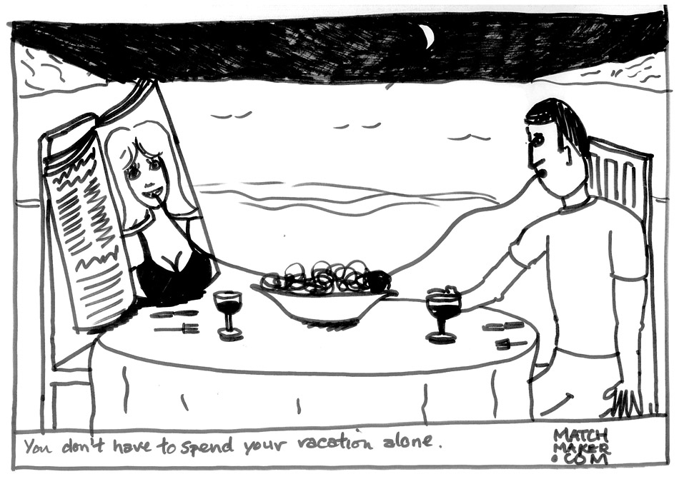
Sometimes the brief can be so specific that there are diagrams or mock ups to follow. It is then up to the photographer to bring their lighting, composition and story-telling skills to the table and bring the sketch to life. I’m going to take you through a shoot I did with art director Thomas Derouault at Euro RSCG in Paris for a matchmaking website.
Thomas and his friend copywriter Peter Moyse came up with the idea together. Thomas scribbled some sketches in his notebook. These were then sent to me when they agreed my photographic style matched what they were trying to pull off. The whole idea of the campaign is lonely looking guys who need a date, who are forced to create their own fake girlfriends.
Once I got over the initial reaction of wondering how this weird project came to be, I started to figure out how I could make it all come together. I had to think about how I was going to dissect this diagram, and make it work in a real environment. When I think about light, I piece things together one step at a time. All of the locations were simple so they were done in my own apartment. I also cast friends of mine to be the models, as it would be difficult to explain to a stranger- “you’re going to play a guy who looks like he can’t get laid.” Casting from model agencies was out of the question, this needed more of a “street-cast.” You might recognize photographer Nick Onken as the model here, who I sort of tricked into being part of this. (He didn’t know what the photo shoot was until he got to my place.)

LIGHTING
1) Main light
Both light sources were generated with a Profoto 7B 1200 battery pack. I was using two Profoto heads total plugged into the same pack.
I wanted the main light to be soft and wrap around the subject (sort of like candlelight). To achieve this effect, the first choice would have been a Proglobe, a spherical “bulb-like” modifier which spreads the light around much like a lamp. However, you must know that I am a cheap-ass, and I don’t own one of these myself. Awhile ago, I made my own. I did some Googling, and found the website 1000bulbs.com, which sells Acrylic Globe Lamp Cover’s in a bunch of different sizes for a small fraction of the price of a Proglobe. The downside is that they don’t mount perfectly onto your light, but with some careful rigging (I used tape), they work pretty much the same.
2) Rim light
This back light is modified with a Profoto zoom reflector. It is gelled with some 1/2 CTO orange warming gel to replicate the light from the city behind him, unifying the light sources together. This also helped separate his dark hair from the already dark background. The reason why I didn’t put the color filter on the main light was simply because there would be way too much warm light going around. I wanted to be able to tell the difference between the two sources.
3) Ambient City Lights
My exposure was .8 of a second, F5 at ISO 200. The reason I dragged the shutter so long was to give some time for the city lights in the background to expose properly.
CAMERA
I used a Canon 1DS Mark III with a 24-70 2.8L lens.
The final shot:
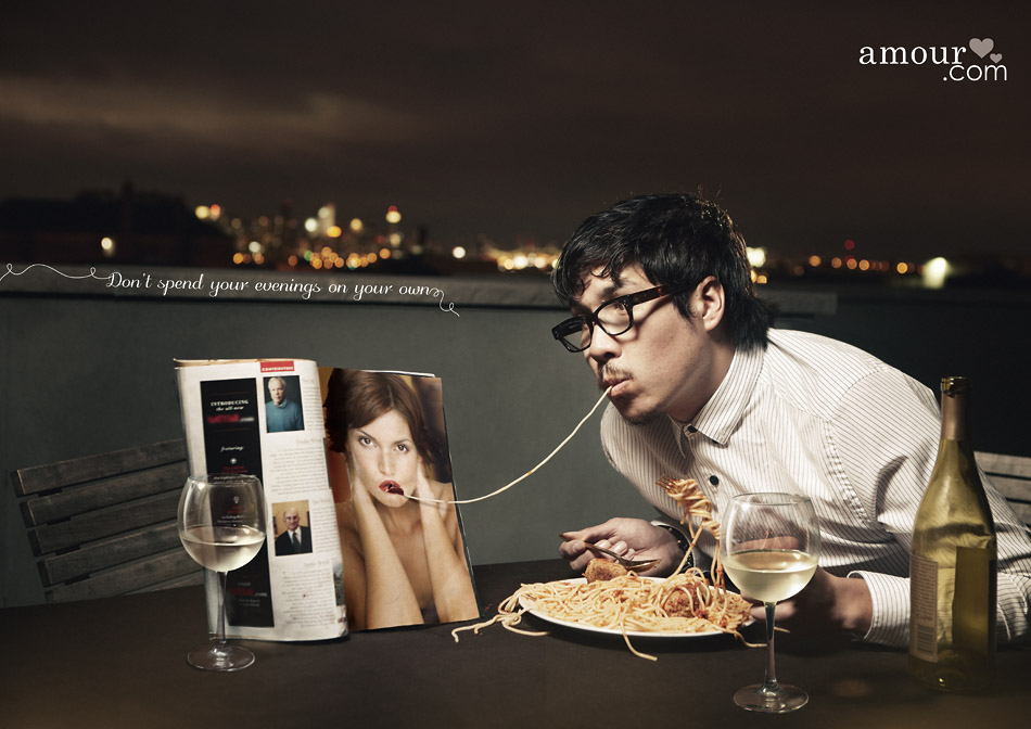
The second setup
In one of the other sketches for the second shot, the composition given wasn’t really working for me. I felt it could be more dynamic if I took a more “over the shoulder” kind of approach, and got right up in the subject’s face. Thomas the art director made it clear that he didn’t need that exact composition, and gave me free reign to do whatever I wanted. It was also my idea to add the lipstick on the mirror. After I made sure I had the shot in the bag without the lipstick, I drew it on myself for a few shots after. (I’m not very good at that, as you can see.) That ended up being the image we decided to go with in the end.
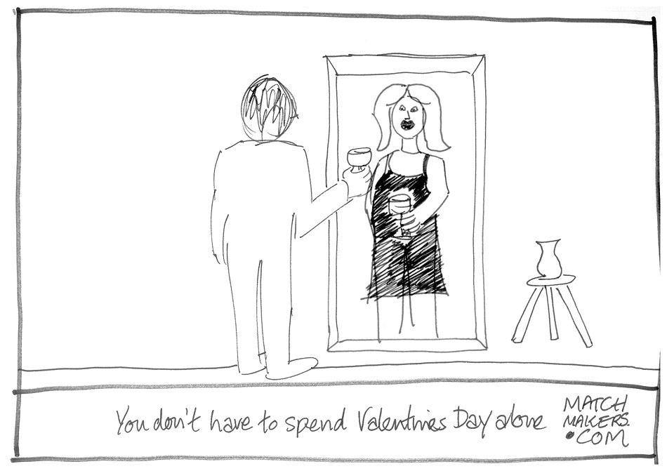
Lighting
The lighting for this shot was much simpler. I used the same Profoto 7B pack with only one head, modified with an Elinchrom Rotolux Octa. I purposely “dirtied” up the light a bit, by having it suspended high above the subject so there were a lot of gritty shadows and atmosphere.
Even if you are given very solid direction on an image, there are always subtle things you can do as a photographer to make the image yours. Those small decisions you make can bring a clients vision to life while still remaining true to your craft.
JL
ADD A COMMENT (43)
Jacqueline // June 15, 2011 16:33
This rules so hard J!
Todd // June 15, 2011 18:00
thanks for this. breaking down the lighting like this is a solid learning tool. awesome stuff man.
Mike F // June 15, 2011 18:20
Rad photos! Always impressed with your work!
Cory // June 15, 2011 18:27
Great post Joey
Tampa Band Photos // June 15, 2011 19:14
The little subtleties of light placement and color are what separate the great photographers from everyone else. I love that you included the original sketches along with the other shots. Thanks for sharing!
Photographer in Doncaster // June 16, 2011 14:46
haha, brilliant photos! thanks for breaking it down and letting us know how you went from sketch to final imagery!
Vishnu // June 16, 2011 14:47
You're a genius in simplicity Joey.. am always looking at ways to make better photos using simple ideas.. Thanks again for sharing your thought :-)
Geoff Heith // June 16, 2011 16:32
Thanks so much for always sharing your behind the scenes stuff Joey...love it.
Alberto / Zumito // June 16, 2011 16:37
Good job. And thank you for the explanations :)
Richard // June 16, 2011 16:48
Thank you once again Joey for sharing you talent with us. you are a very creative photographer I look forward to your work in the years to come.. I hope you will have a showing soon in NYC and let us know where and when it will be.. regards,RichG
brad // June 16, 2011 16:52
your mirror shot knocked me out.funny ,sad ,
Malinowski // June 16, 2011 17:04
Joey, as always, you are a favorite photographer of mine. You NEVER disappoint!I am wondering whether the magazine in the ad featuring the magazine, would have had the pages mocked-up/replaced, to avoid copyright issues.Cheers,Stan
JOEY // June 16, 2011 17:36
Hey Stan- all the images in the magazine had to be digitally replaced. The images in the final picture are all cleared
Charlie // June 16, 2011 18:16
Cool. Thanks for this great info. Love your pics.
Lucia // June 16, 2011 18:22
Great job joey ! I find your guides really useful, so thank you so much :)
tom_the_ad // June 16, 2011 22:18
If I may add what we creative people in agencies look for in a photographer's work.You get the idea, spend a hard time getting it approved and build an idea of what it "should" look like.Then you can do it two ways. Either you try to replicate exactly the image you imagined overtime, let an uninspired photographer bring you just that, or you get someone like him, who gives you an extra layer of quality and creativity. Guess what makes the best campaign?
Tristan Shea // June 17, 2011 02:20
Thanks Joey! I love the second mirror one. Thanks for taking the time to post this BTS.
Kimberley F // June 17, 2011 02:26
My students are going to eat this up....I know I did! Thanks for sharing as it's so inspiring for my high school students to see theory put into action.
Sarah // June 18, 2011 02:44
I love your work! And explaining the lighting really does help for me to understand how to get some of these great types of shots. Thanks!
----- // June 19, 2011 01:24
Hello! Awesome work, Joey. I'm always spechless with your photos. But... I'm curious. Do you edit much your photos? In photoshop, for example? If yes, which effects do you use?
janneth // June 19, 2011 19:24
you´re the best photographer ever..!!! i love your work you´re my inspiration I hope to be like you someday...:D
joe // June 20, 2011 07:01
thanks for always sharing so much ... it's awesome
Juan R // June 20, 2011 15:16
Here in Argentina, i saw a documental of yours going to Africa. I always liked photography but the last 10 yeras i was more into drawing and 3d. BUT...that documental inspired me so much that i´m now again interested in photography. Your aproach to portrait people, and real connection with the world is what inspired me a lot. Is not about the image...is about the story behind the image and the connection with the subject what matters...now i can see that thanks to you...Thanks.
douwe // June 20, 2011 16:56
thanks for that walkthough, and cool photos.but one little thing...candlelight is hard light;)I'm also interested how you got that brown look in post!
steve // July 05, 2011 11:39
just want to thank you for sharing so much of yourself and your talents, it is rare to find someone who is not afraid to share their skills and talents in such an open and giving manner..thanks
Mundhir Eltahir // July 06, 2011 17:40
Spectacular work Joe.I wish you could teach me photography. I will be your good student :)
outdoorhose // July 16, 2011 17:05
wow, i realy enjoyed the read. thank you for sharing!
Yudhvir // July 17, 2011 17:05
As ever brilliant. I love your work, your DVDs and on top of it your passion. Can you please also explain a bit about post processing in these two pictures.
fotomate // July 29, 2011 04:58
good one :) catchy and funny
Branden Harvey // August 09, 2011 01:06
This is so rad. I love seeing your thought process here.
Selam // August 17, 2011 16:37
I run into your site and couldn't leave. I am from the land of Abyssinia but from the city :-) these pictures are so alive you brought tears to my eyes....OK I cried :- ) and now I am home sick (live in Cali). They took me ages and miles away, the expressions on the faces, the eyes ..everything. I just don't have words. It touched me in some emotional way, what every good picture should do.You are very talented. Thank you ,Great work. And shared it with everybody I know :-)
Essex Wedding Photography // August 20, 2011 21:56
Joey another piece of great work, thanks for sharing
pino // August 20, 2011 22:48
*****sehr coole seite *****
Edward Ma // August 21, 2011 07:15
haven't see the update of the blog, looking forward to it~
Idene // August 29, 2011 13:06
Hey man, love that shot with the guy in the mirror, the guy looks so pathetic haha.
Fabi // August 30, 2011 03:52
hi! mi comment has nothing to do witch the publication and my inglish is very bad.I saw a documentary about your photos in Etiopia and and I loved it... anyway, i just wanted to say that from Chile (sudamerica) your work is much appreciatedyou won a fangood luck!
celeste // August 30, 2011 23:19
Me encantas!!!!! ;)
celeste // August 30, 2011 23:27
I dont speak inglish but pushme Jaja I hope see any day
Jovee- Childrens Photographer, Gardner KS // September 01, 2011 14:58
Beautiful lighting humor = Amazing!You nailed it man, well done!
alim // September 02, 2011 03:01
great concepts! look fwd to your next posts :)
Denis // September 06, 2011 17:16
Hey Joey, thanks for sharing your experiences and way of working. Always great pictures.
Wilson Huang // October 28, 2011 05:41
I would love to be your assistant some day
Mark Berg // November 17, 2011 08:13
What are the best Nikon lenses for wedding photography?
Your comment has been posted