I recently had the privilege to collaborate with Variable and photograph the campaign for National Geographic Channel’s feature film “Killing Lincoln”, based on Bill O’Reilly’s book of the same title. My good friends at Variable produced all the promotional video for the TV commercials and I shot the stills for the print advertisements. By combining both the advertising photo shoot and the video into one large production, we could work in a more elaborate set and obtain the highest production value possible. This type of collaboration can only work if the photographer and the filmmakers are on the same page. From the production’s early conception, Variable and I were working together with National Geographic on mood boards, lighting references and even the compositions we wanted to include in both the promo videos and photography. Without a collaboration like this, the filmmakers and photographers would work on separate productions. They might try to re-create the same set, or work at different times and obtain visuals that don’t have the same cohesion that you can get when working together. In this case, our collaboration was definitely the best option.

I can’t take credit for the ideas and concepts of the photos. Creative director Andy Baker at National Geographic and his team came up with the concepts of photographing Lincoln and Booth together. Historically, this is a very odd pairing. To see them standing beside each other, posing for the camera is very unusual. However visually, I think it’s quite a captivating idea. Instead of a traditional re-creation of Lincoln’s assassination by John Wilkes Booth, we wanted to create a highly stylized visual metaphor. You can view the entire gallery of images here, while this particular blog post is meant to be more light-hearted.
Test Subjects VS Real Subjects
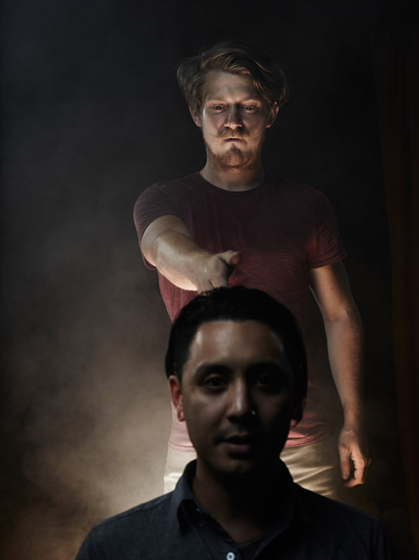
In almost every photo shoot I do, I have these kind of bizarre outtakes somewhere in my session folder of images.
On productions like this, I often pre-light the entire set before calling the main subjects over to have their photos taken. This way, productions can flow smoothly between setups, and no precious time is wasted spent fiddling with lights.
For “Killing Lincoln”, we all wanted to be test subjects, (perhaps for Facebook photos and bragging rights?) In the end, none of us ended up looking nearly as cool as actors Jesse Johnson as John Wilkes Booth and Billy Campbell as Abraham Lincoln.

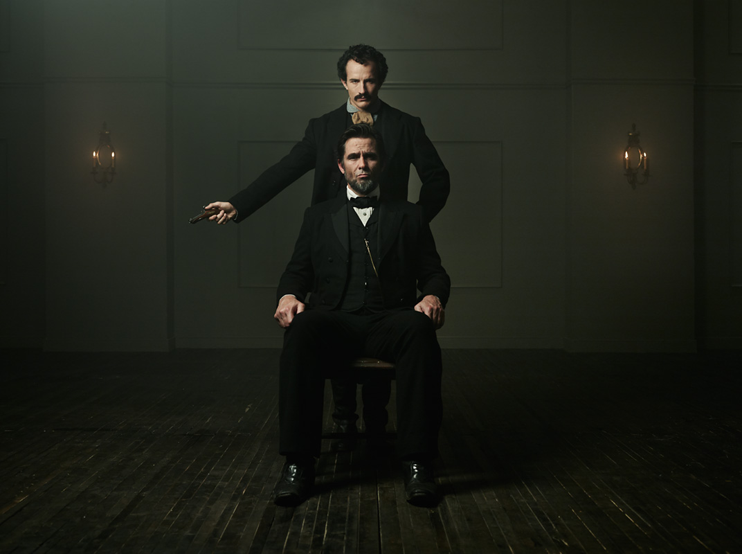
Above: Creative Director Andy Baker and Christos DeVaris from National Geographic Channel summon their inner Booth and Abe. Fun fact: In the background you can spot Joseph Sciacca, (the set designer) putting the final touches on the wooden floor. Click image to enlarge.
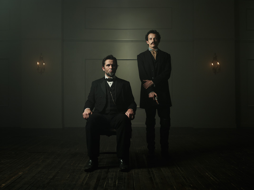
Above: Another variation of the same pose.
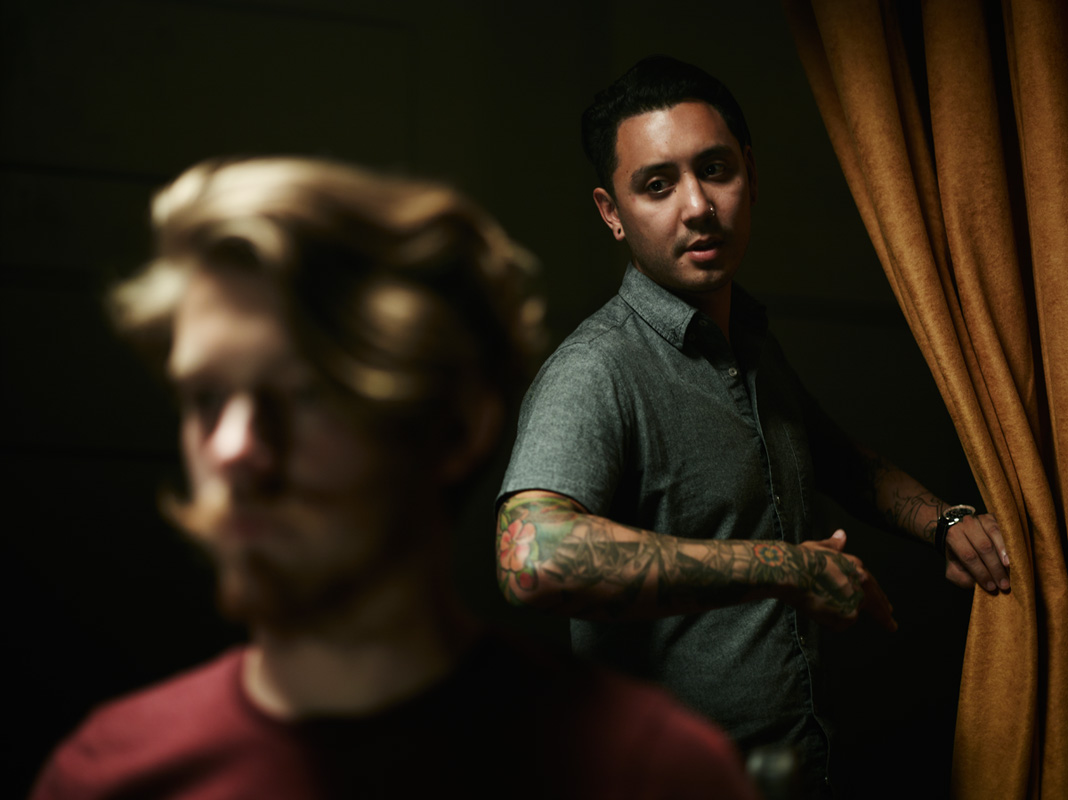
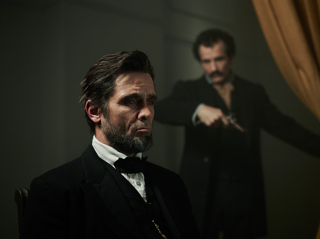
Above: You can see that did a last minute tweak on the composition and light for the final photograph. I also played with shifting the focus on Lincoln or Booth.
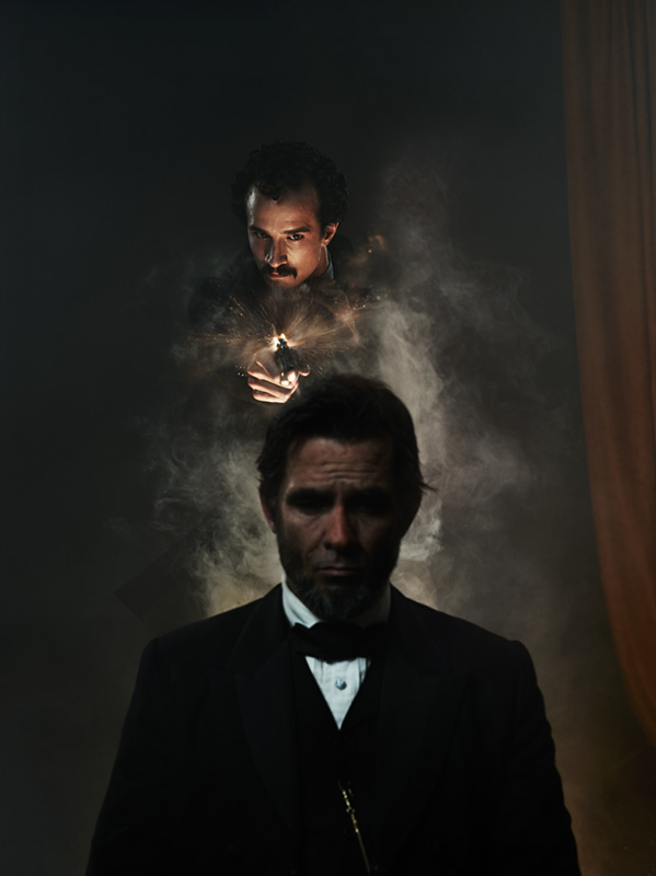
Above: Before the shoot, a firm production schedule was created to budget time for executing as many concepts as possible. This gave the National Geographic Channel many options to choose from when finalizing the direction for the campaign. The image above was one of the many concepts photographed on the day of the shoot, but eventually wasn’t used as part of the bigger campaign. After the Newtown shooting, The National Geographic Channel chose to slightly alter the campaign creative out of respect for the victims of that tragedy, and picked options where the weapon wasn’t being fired.


Above: The hat changes everything!
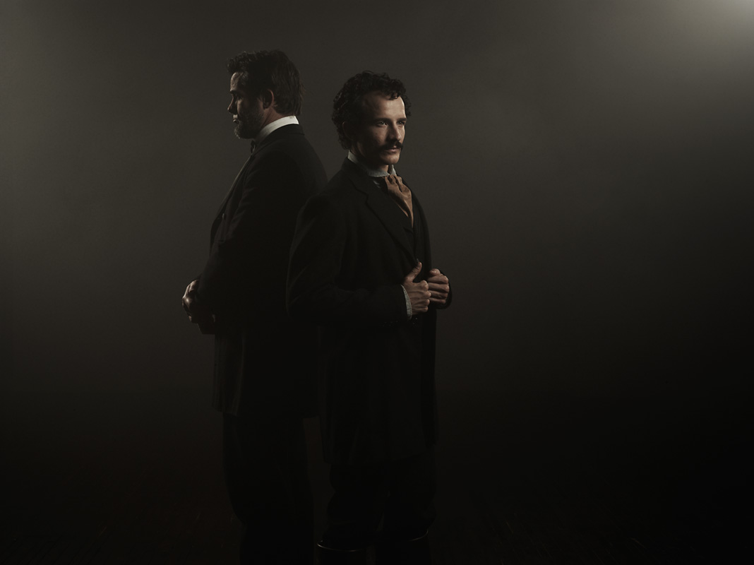
Above: Here’s the same concept as before, but with Lincoln and Booth swapping positions.
Here are some other misc images from the shoot:
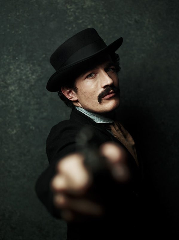
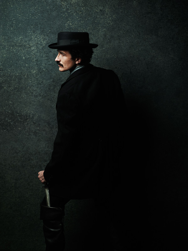
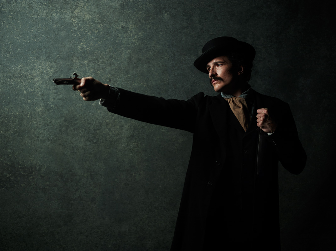
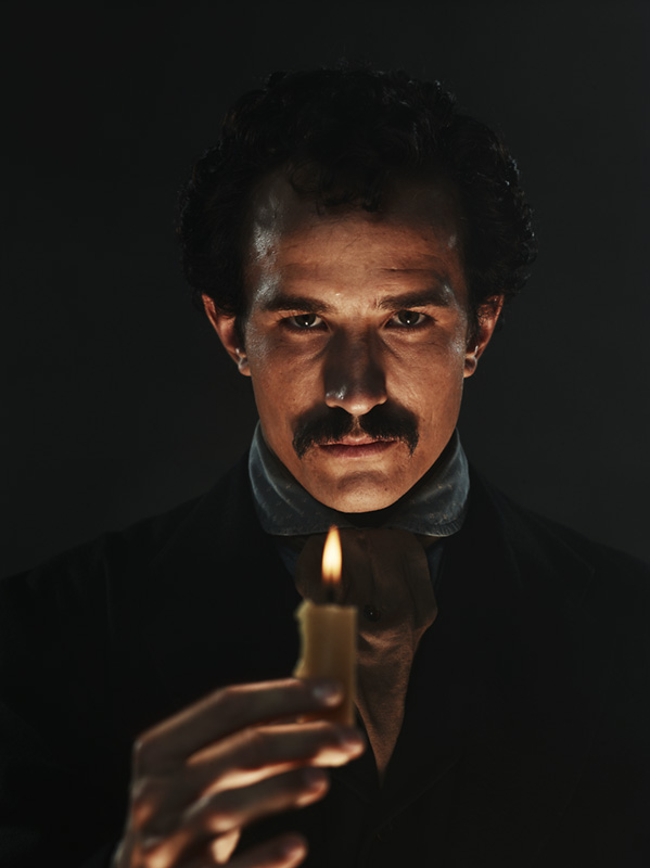
Above: Jesse Johnson as John Wilkes Booth.
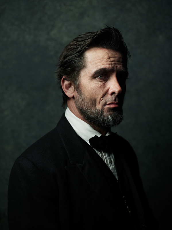
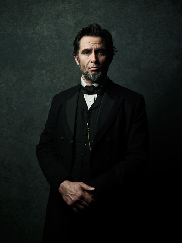
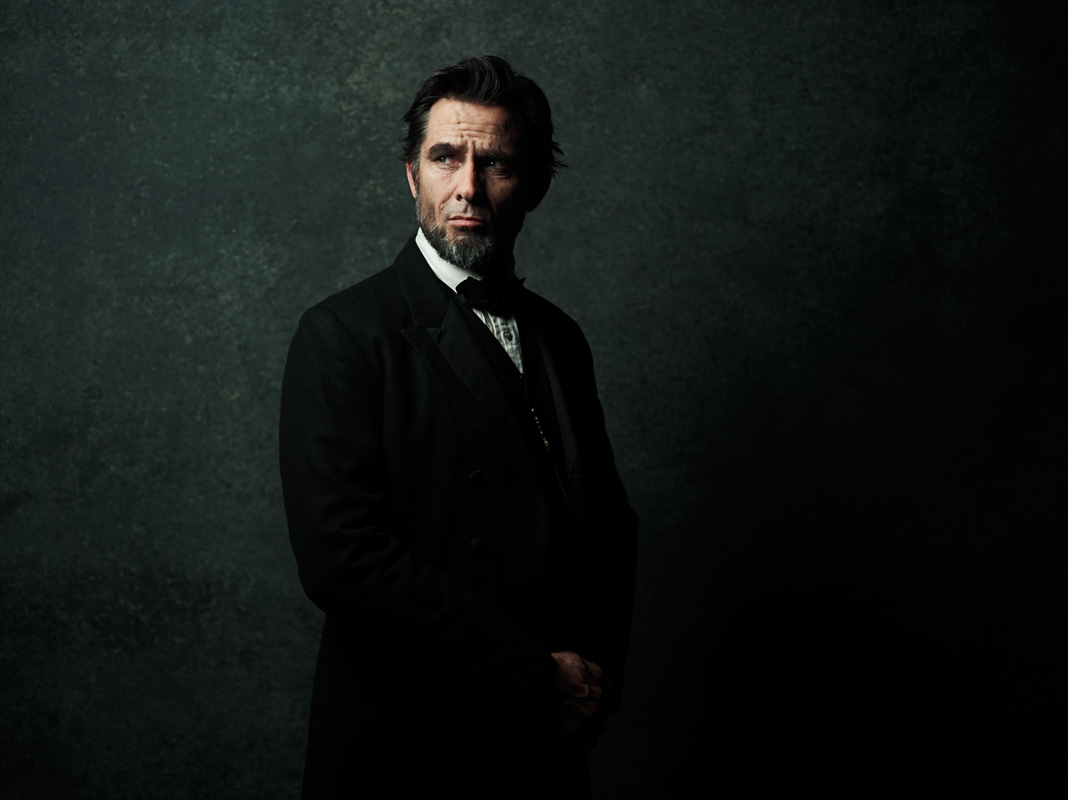
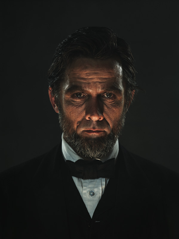
Above: Billy Campbell as Abraham Lincoln.

Above: One of the last setups of the day.
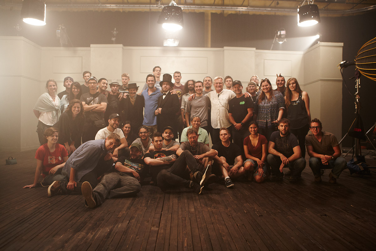
Above: All of these people made it happen!
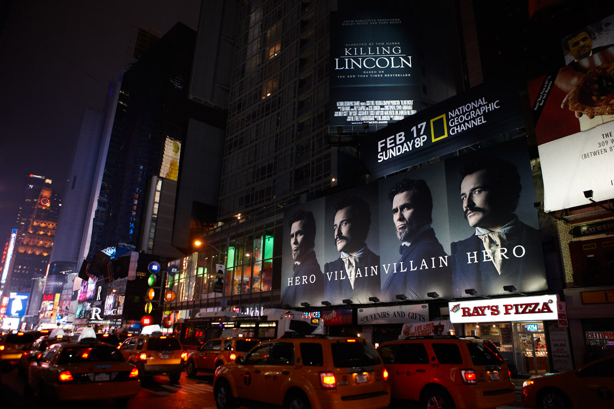
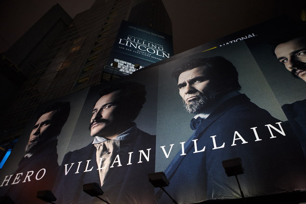
Above: Some billboards advertising the movie in Time Square, NYC
And of course, I’ll leave you with Variable’s video promo and a behind the scenes video.
Above: A 30 second teaser cut.
Above: A behind the scenes video shot by Jon Connor.
Video Credits:
Client: National Geographic Channel
Title: “Killing Lincoln”
SVP/Group Creative Director: Andy Baker
Design Director: Christos Devaris
Production Company: Variable
Creative Development: National Geographic & Variable
Director: Jonathan Bregel
Producer: Tyler Ginter
Cinematographer: Khalid Mohtaseb
Production Designer/Art Director: Joeseph Sciacca
Photographer: Joey L.
Post Production: Goodpenny
Executive Producer: Rasha Clark
Editor: Eric Wais
Assistant Editor: Matt Hartman
Color Correction: Matt Schwab
Flame Artist: Carmen Maxcy
Titles & Motion Graphics: Maha Mohtaseb
Composer: John Kaefer
Music Produced & Mixed By: David Wolfert
Sound Design: Goodpenny
ADD A COMMENT (23)
Bazo // January 31, 2013 04:21
Joey, two words: AMAZING JOB.
Alec Vanderface // January 31, 2013 04:30
well done sir
Sebastian // January 31, 2013 05:46
Great work. Did you happen to utilize the existing lights on the set used for the video, or did you light separately?
david shepherd // January 31, 2013 06:25
Great job Joey. Your stills compliments the motion very well, virtually seamless. I love the look and I am sure that you influenced the DP/Motion Crew. Thanks for sharing.
David.
PS. Put this in the new book...LOL
Fabiano Silva // January 31, 2013 06:34
In these great productions, is there any chance of shooting during the real filming, I mean, on set?
jane // January 31, 2013 06:37
you are incredibly gifted.
Pasha Belman // January 31, 2013 06:48
Killing Lincoln Photos are amazing. You did an awesome job. Big Fan.
Michael // January 31, 2013 07:18
Beautiful light Joey.
Aga // January 31, 2013 11:32
Amazing photos! I love it!
Lovro // January 31, 2013 17:59
Awesome photos Joey! Wich lenses did you use for this shots? I guess the camera is your medium format?
Marco // February 01, 2013 06:36
I love your lighting tech... How about a " how to" specifically on creating that hazy (misty) effect . Is it possible without BIG studio lights?
JASON GEORGE // February 01, 2013 09:22
Nice work, Joey- I like the firing effect you created in one of the shots!
Cheers.
JG
Jennifer // February 02, 2013 01:07
Thank you for sharing the creative process with us. I love to see multiple ideas to see how the final product comes about. I also received your latest book as a Christmas present, I'm reading it slowly to savor it!
Thomas // February 02, 2013 20:55
Wow, amazing pictures! I have read your books and love your work! Greetigs from Germany!
Deedee // February 02, 2013 21:59
Thank you for sharing; so amazing.
Guillaume Megevand // February 04, 2013 13:24
Awesome Joey. Can we get another ost with lighting diagrams? Would be great!
Marian Majik // February 06, 2013 18:02
Interesting work and story - good luck with next one!
Anne // February 18, 2013 01:13
Love the decisions you made on this shoot- especially the subtractive elements. Thanks for sharing a few behind-the-scenes set ups as well.
David Corle // February 22, 2013 01:54
Amazing work as always Joey. Your lighting is impeccable. A true inspiration to us all.
JereK // March 14, 2013 23:40
Incredible shots.. Love the idea and but the implementation is what impresses me!
Malcolm Brown // May 17, 2013 20:52
Joey, great stuff. Been tooling around your website and blog for a bit. Great stuff.
Przemek Wrobel // June 17, 2013 22:55
amazing totally mega professional work :)
Eric Farrell // December 27, 2016 13:33
What style of hat is Jesse wearing as John Wilkes booth? I love it and have been looking everywhere and can't figure it out.
Thanks
Eric
Your comment has been posted